

Ian Murphy of MurphyTrading.com states; with the first half of 2022 starting to appear in the rear-view mirror, one question is on everyone’s lips, ‘When will the bear market in stocks end?"
For passive investors, the end of a bear market will mean no longer having to sit through a painful drawdown in equity as they ride out the storm. For active investors, an end will mean getting out of cash and finally back into stocks.
Let’s examine the question from fundamental and technical perspectives.
Click images to enlarge
Fundamental
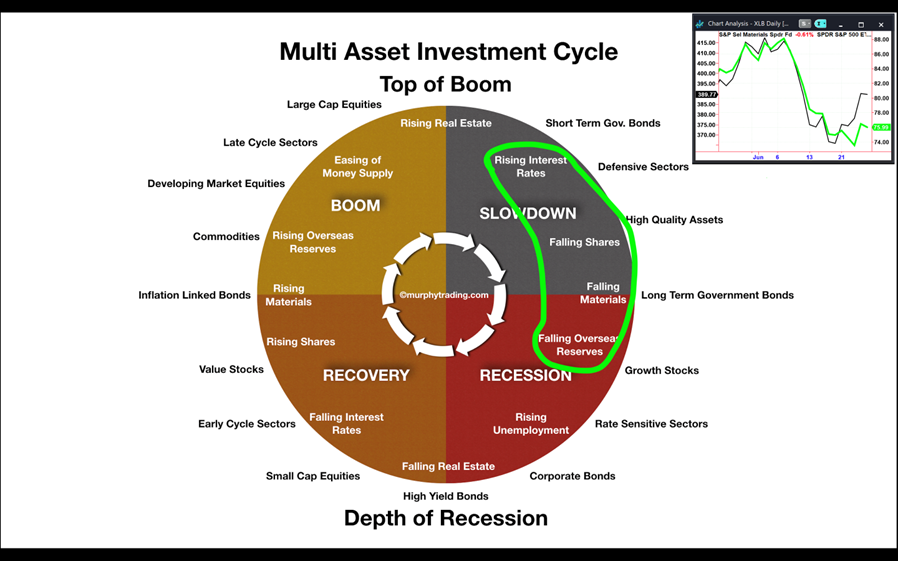
Casting an eye over the Multi-Asset Investment Cycle, it’s obvious where we are these days. ‘Rising Interest Rates’ and ‘Falling Shares’ are old news but reports of falling commodity prices (especially metals) are finally appearing in the mainstream media despite the fact materials have been dropping for almost a month (insert chart). In addition, Sri Lanka’s dwindling overseas reserves are well documented, but a few others such as Nepal and Egypt are waving red flags.
So, according to this fundamental cycle we are about halfway through the bear market, and we need to see ‘Rising Unemployment’ and ‘Falling Real Estate’ before a recovery takes hold, and then it’s ‘officially’ time for investors to get back into small-cap equities. For more on the investment cycle, check out the Education page on MurphyTrading.com.
Technical
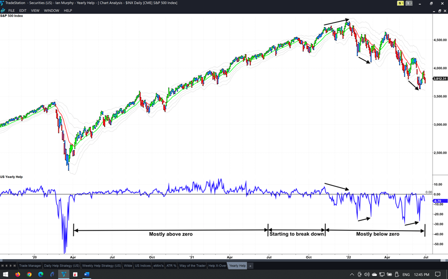
The Yearly Help Indicator is one of the most reliable stock market indicators I know of and remains one of my go-to references when trying to identify a potential change in the direction of a market before the change becomes common knowledge.
It’s known as a ‘market internal’ indicator because it looks at every single stock in a market by counting the number of stocks that are making a new 52-week high, and the number making a new 52-week low, and then by subtracting the lows from the highs.
To allow for fluctuations in the number of stocks over time, and to use the indicator on any international stock market, we express the result as a percentage of all stocks. So, it’s ‘Highs Exceeding Lows Percent’ and that’s why I call it a "HELP" indicator.
For part-time traders and investors who can’t spend all day looking at screens, this is a quick reference guide to an equity market. It doesn’t matter if we have been out of the markets for a few weeks or a few years, if we ask the following three questions of this indicator, we will be immediately up to speed:
1. Where is it relative to the zero line?
2. Where was it for the past few weeks?
3. Is there a divergence?
Click images to enlarge
When applied to the US equity market we notice the indicator spends most of the time above zero in bullish conditions, but helpfully starts to break down before the market does. In bearish conditions, it stays below zero, and it is only when this indicator can get back above zero and stay there that we will see a sustained rise in stock prices.
Finally, look at the divergences highlighted with black arrows. When the S&P 500 (SPX) and the indicator print opposing peaks (one going up, the other going down) we get an early warning of a change in market direction. These divergence signals don’t produce results 100% of the time but have a success rate that is high enough to be profitably traded and to keep us from being on the wrong side of the market.
Weekly Trend Following (WTF)
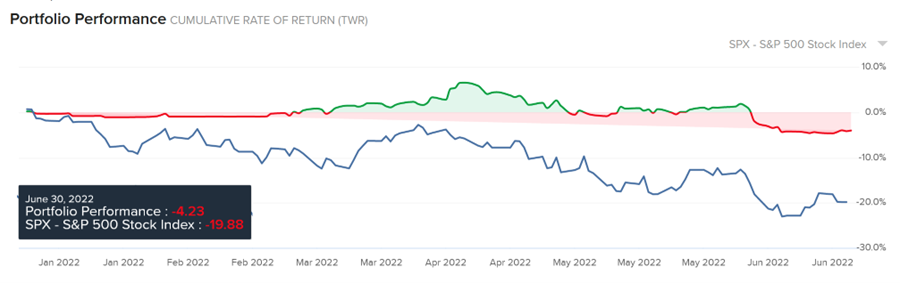
At the beginning of the year, I ring-fenced the Interactive Brokers account for this strategy. The plan was to use real trades on a real account to demonstrate to clients how to build and actively manage a stock investment portfolio.
By the end of January, it was becoming apparent the bull market was losing steam. By February we were technically in a bear market, but I persevered with the campaign. Normally I wouldn’t begin a strategy campaign against the prevailing market trend, but I made a commitment to demonstrate the WTF strategy and I tried to do that with defensive and counter-cyclical stocks.
Click images to enlarge
As we pass the mid-year point, all open positions recently closed below their protective stop levels, so they have been sold. The account is now entirely back in cash (€47%, $53%) so there is little to demonstrate this month. A year-to-date performance review reveals the account equity is down 4.23% in euro terms. Some comfort may be drawn from the fact that the S&P 500, the benchmark against which I measure the campaign, is down 19.88% over the same period.
If I was a fund manager, I would probably be telling my clients the "good news" that we outperformed the benchmark by 16.5% in the year to date.
If you recall, the trades were a mixed bag, but they were all managed closely and closed out when the weekly bar closed below a -1ATR line. By cutting losses quickly this way we preserve cash which allows us to capitalize on opportunities when they next arise.
This approach to active investing demonstrates the importance of risk management in real-life conditions. We were attempting to go against the prevailing market trend with multiple positions, and the market kept telling us we were wrong. By using protective stops, we were receptive to the market’s message and our losses were controlled.
Now the market is telling us to stand aside and preserve capital.
Learn more about Ian Murphy at MurphyTrading.com.


