

Last Wednesday’s note highlighted the new all-time high on the S&P500. But as ever, a deeper look under the surface can reveal a different picture. We just had an important divergence, writes Ian Murphy, founder of Murphy Trading.
The Composite Indicator (also known as Composite Help) looks at all stocks trading on US exchanges which are making new highs and lows on three timeframes: Monthly, quarterly, and yearly (bottom lines on chart below), and merges the results into one indicator (orange line).
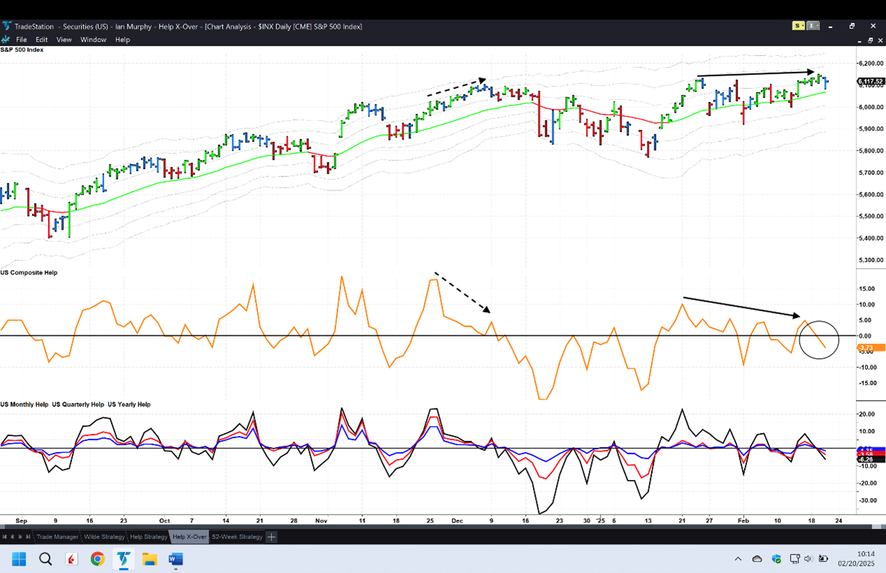
This is a leading market indicator which tends to ‘go ahead of’ or precede a market move as measured by the S&P 500. The theory is, if we look at all 5,000 (approximately) stocks, you can see where the top 500 are likely to go next.
A bearish divergence between the indicator and the S&P500 (dashed arrows) is a strong signal of an impending downward move. We just had another divergence (solid arrows) and a crossover of the zero line (circle), which supports the signal.


