
Stocks or futures that gap up or down can present high-probability trades, but Scott Andrews shows the ideal morning gaps, as well as others that should be avoided at all costs.
Talking with Scott Andrews about gap trading, and Scott, I know you trade the gaps, but do you have any edge in trading these gaps?
I do; that’s worked well for me, and I’m happy to share it with people that like to trade gaps or that are interested. My edge starts with where it opens; specifically, where a gap opens relative to yesterday’s price action.
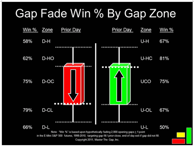
You’ve got the daily price action; the high, the close, the open, and the low. Those four levels create five different zones. So I pay a lot of attention to that, and what my gap zone map here shows you…this is 12 years of data, so it’s almost 3000 gaps in the S&P 500 futures.
Click to Enlarge
If you look, the left side represents gaps that occur after a down day; a red candlestick. The right side represents gaps that occur after an up day where you closed higher than you opened; that forms a green candlestick.
The key point here is that I pay attention to trading gaps that open in the highest-probability zones, but most importantly, I avoid the gaps that open in the lowest-probability zones, and that’s an easy takeaway.
This map will keep a lot of people out of trouble if you just pay attention to, for example, the UL zone. The bottom-right-hand corner there shows you that only 50% of all gaps that have opened below the low of an up day have filled, and that’s a terrible number if you’re a gap fader like me, where you’re targeting the prior day’s close.
There’s no edge there. You should leave it alone, and you might even want to think about looking for opportunities to trade to the south side, or going short.
So definitely avoid that area.
Yeah, my acronym for that one is it’s a BLUD gap; below the low of an up day. If you try to trade that, you might get a little bloody.
NEXT: Past Data Shows Best (and Worst) Gap Set-Ups
|pagebreak|How about the historical ramifications of it; how did you do the past year?
Well, that’s a good question, because the probabilities do change each year.
I do tend to focus on what’s happened the past seven to ten years in all of my analysis, but the probabilities do change year to year, and if you want to look at this next slide here, this is a summary of fading the E-mini S&P 500 opening gap; fading it specifically.
That means shorting an up gap, buying a down gap; and you can see last year was right in line with historical norms.

Click to Enlarge
Seventy percent of all opening gaps last year filled by the end of that very same day, so as a gap fader, that’s an edge. I’ve got a 70% chance of the market moving in my direction at some point during the day.
If you look a little bit further, the best and worst zones, ironically, are what I call sister zones. The DL zone— gapping down below the low of a prior down day—was the most profitable zone of all.
The year 2010 was fairly bullish, so the big money was buying those big, scary down gaps and riding it back up to the prior day’s close and somewhere beyond.
But if you look at the next bullet—the very bottom there—the least-profitable gap zone was the UL zone (the BLUD gap zone), and there were only nine of those last year.
That’s a gap below the low of an up day. Only one of them filled, so just simply the direction of that candlestick made all the difference.
The chart says it all.
I ought to get it framed. It’s not framed by my desk yet, but it’s made a huge impact in my trading over almost ten years.
Related Reading:


