
Rick Wright of Online Trading Academy shows how select moving averages and time frames can make it easy to spot key support and resistance areas and still not produce clutter on the charts.
At Online Trading Academy, we look to short in supply zones in downtrends and go long in demand zones in uptrends. Easy enough, right?
Theoretically, yes, but the main question is "Which time frame are you using to determine direction?" This week's lesson is specifically applied to you daytraders out there.
First off, let's define a daytrader. In the stock market, it is someone who enters and exits the trade in the same trading day, buying 1,000 shares of XYZ in the morning and selling those 1,000 shares in the afternoon, for example.
In the spot forex market, the trading day isn't as clearly defined. For this lesson, we will assume you are looking to be in a trade for a few minutes to a few hours and trading off of a 15-minute chart.
Next we have to define what a moving average is and why we would use it. Investopedia defines a moving average as "an indicator frequently used in technical analysis showing the average value of a security's price over a set period. Moving averages are generally used to measure momentum and define areas of possible support and resistance."
Most of you have probably used a moving average or two in your trading career; they have been around forever. In my own trading plan, I have a few strategies/techniques that I use to enter and exit trades, as I'm sure you do as well. I am personally using several moving averages from the daily and weekly charts on my currency pairs and applying those figures to my 15-minute intraday chart for a short-term (almost scalping) trade style.
Why? Because major money movers like hedge funds, multinational corporations, and banks (the institutions we talk about so often) are using them for direction and entry. If price pulls back to a moving average, many big-money players will use that retracement to re-engage in a longer-term trend.
I, however, am a shorter-term player. Knowing that these institutions will be scaling into a trade as price is hanging around a moving average gives me a chance to join them for at least a few little pips to add to my account.
So which moving averages should you use? Well, the possibilities are endless, but here is what I personally use: 50-, 100-, and 200-period simple moving averages and 50-, 100-, and 200-period exponential moving averages from both the daily and weekly charts. Yes, there are six wiggly lines on both charts, for a total of twelve possible levels to mark!
For example:
Click to Enlarge
Click to Enlarge
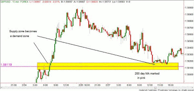
Notice how price action seemed to respect or bounce off the particular moving averages over time. This shows the power of the institutions and their use of the wiggly lines. If only we could harness the power of those darn institutions for our daytrading. Well, here is how you can do that.
I mark the location of these daily and weekly moving averages on my 15-minute chart and use the intersection of pure supply and demand zones with them to short-term trade intraday.
NEXT PAGE: Shooting Stars, Candles, and the Bottom Line
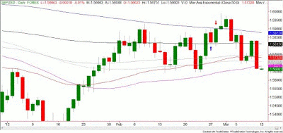
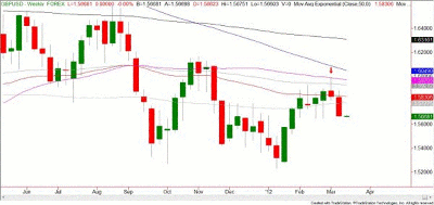
|pagebreak|On the following 15-minute chart of the GBP/USD currency pair, from a historical perspective, only the 200-day exponential moving average is marked for clarity's sake, but on my own charts, I will mark the location of whatever averages are within a couple hundred pips of the current price.
Notice how the 15-minute chart came right down to the 200-day moving average marked in pink and bounced off of that level? Of course, it was an intersection of a previous supply/demand zone, but this odds enhancer certainly helped me choose the correct demand zone to go long in. You can see on the daily chart that we hit the 200-day simple moving average just a few hours later, so this was a nice move.
Click to Enlarge
Now look to the next day and the shooting star candle. Wonder why it chose to stop right there? Take a look at the weekly chart above. That would be the 50-week exponential moving average stopping our GBP/USD pair dead in its tracks.
Looking to the left, there isn't a clear supply zone that would indicate that this pair would stop at the 1.5990 level on either the daily or weekly chart, but that moving average stopped the price from going any higher.
Here is the bottom line: mark a few of these moving averages on your intraday charts and look for clean supply and demand zone intersections for your intraday trades.
By Rick Wright, instructor, Online Trading Academy


