There is no doubt that the markets have been trying to move higher and higher recently. The questions on most traders' minds are: "How high can the indexes go? Is this still a bull market?" We can look at several technical indications to try and answer this question. To summarize my overall perspective on the markets right now, I'd have to say I am a very nervous bull.
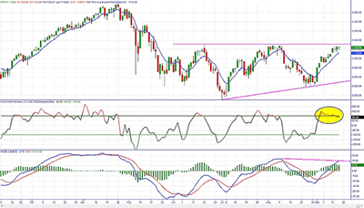
Looking at the chart of the S&P 500, you see that we have approached the resistance level first established in June of this year. This is not the first time to the level, however. We successfully tested this area of supply back in early August and the selling pressure drove the index lower. Those of you who have taken Online Trading Academy's training already know that multiple touches of a support or resistance level will weaken that level and can cause it to break. This suggests that we may be seeing higher prices on the S&P 500 and other indexes.
Note some interesting things shown on this chart. The S&P 500 is forming
an ascending triangle formation that hints at a breakout to the upside. The
momentum indicator MACD also signals growing bullish momentum. However, pay
attention to the negative divergence on both the MACD and the CCI indicators.
The breakout will not likely occur on this test of resistance. We may soon
correct back down to the bullish trend line that marks the lower portion of the
triangle.
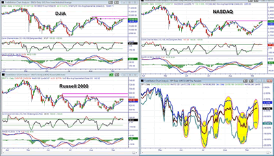
Turning our attention to the other major indexes, you will notice
that even though the Dow broke the June highs with the August bull thrust, we
are having difficulty in exceeding the supply created by those August highs in
the first test of that supply. The Nasdaq is mirroring the Dow's chart, and the
small-cap stocks represented by the Russell 2000 index are showing more
weakness.
The chart at the bottom right of this picture may be the most telling. Here, I am examining all four ETFs that track the major indexes from a percentage change basis. In black is the SPY, the ETF for the S&P 500. The maroon line is the QQQQ ETF that follows the Nasdaq 100. In the blue is DIA, the ETF for the Dow, and finally, I have IWM, which mirrors the Russell 2000 index, in teal.
These indexes and ETFs represent the stock markets and investors' views of the US economy. They should typically move in the same direction. When one or more of these indexes diverge from each other, it is usually a signal that a trend change is imminent. I have highlighted the past and current divergences and you can easily see that they have market turning points in all of the indexes. We are experiencing one of these divergences now as the small-cap Russell is failing to maintain the gains of the Dow and Nasdaq 100. Even the black SPY line has started to break away from the two leaders.
Be mindful of your stops and watch for warning signs of a correction in the markets. I am writing this article several days before it will be published, so the correction may already be in place by the time you read this. However, now you have an added tool in your arsenal to understand the market movements and increase your potential for profitable trades. Until next time, trade safe and trade well!
By Brandon Wendell, instructor, OnlineTradingAcademy.com


