

Joey Fundora shows us an easy way to compare individual stocks or etfs to the general market, which can be important when deciding when strength is genuine or fleeting.
Ratio charts are a good way to assess the strength of an stock versus the market or another peer. In a strong market, it can be easy to confuse general market strength as sector strength, since the majority of assets will follow the general trend. However, a ratio chart against a market index can reveal how an asset is performing against the trend.
In this case, I am taking a look at some industry ETF’s against the S&P 500 ETF (SPY). While there are no hard and fast rules, in general you can treat ratio charts much like any chart. An uptrend is an uptrend and a downtrend is a downtrend.
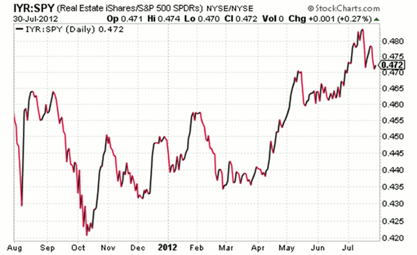
The first chart is showing Real Estate iShares (IYR) versus SPY. It is clear to see that REITs have been performing well over the past few months. In fact, in looking at several individual charts in the sector, like Simon Property Group (SPG), Kimco Realty Corp (KIM), and Essex Property Trust (ESS), I see stocks that are likely to find support on any weakness.
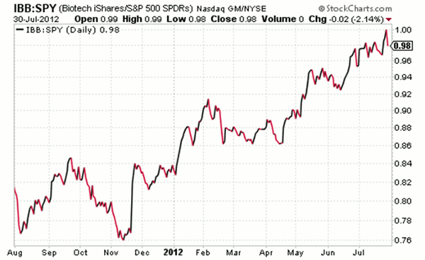
Biotechs have been hot, hot , hot and this ratio chart reveals that this trend has been occurring since late last year. While it’s fun to try and pick a top, this industry remains in a solid trend. While some biotechs are surely in need of rest, iShares BioTech (IBB) is at all-time highs, which is tough to bet against.
I’ve been on some oil stocks recently, like InterOil (IOC), after noticing some strength on a weak day.
Next: Energy Select Sector SPDR (XLE)
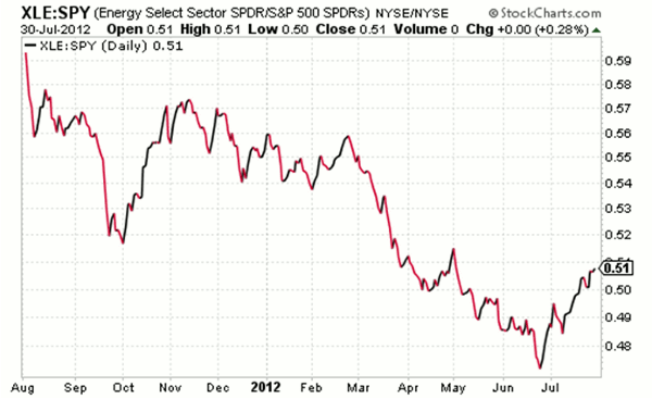
|pagebreak|While oil services stocks, as represented by Energy Select Sector SPDR (XLE), have actually been trading well when compared to SPY over the past month, the longer-term trend is clearly down. This may result in some pressure in this space on any market weakness. Stocks like Halliburton Co. (HAL) are quite extended and approaching resistance levels.
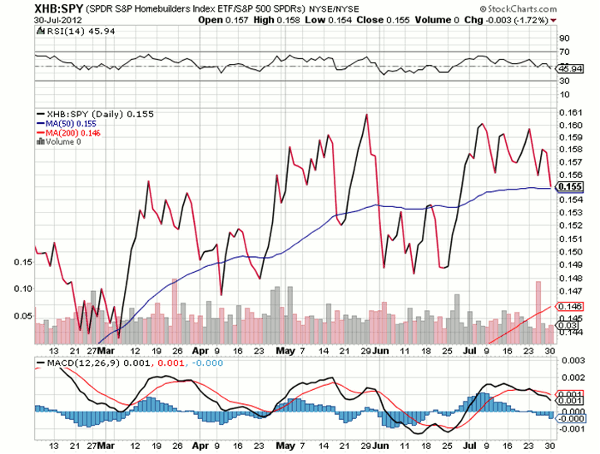
Obviously, ratios bottom and top just like stocks do, but often it takes much backing and filling before a reversal. These are only a few examples, but there are other interesting ratios currently developing, such as SPDR S&P Homebuilders Index ETF (XHB) vs. SPY:
While many charting packages allow you to graph ratio charts, I typically use stockcharts.com. All you have to do is put a semicolon between two tickers to graph its ratio. Give it a try if you’ve never used them before.
Joey Fundora is a trader and blogger at Downtowntrader.com.


