

"Don't tell me what to buy; tell me when to buy it," was one of the favorite sayings of our newsletter's founder Richard Russell, notes Jon Strebler, editor of Dow Theory Letters, which continues the late Dick Russell's investment analysis.
We have documented how gold is not a particularly profitable investment in the long-run. But like anything else — it has its days (and years)! Do you want one really powerful indicator to tell you when gold is the place to be? I nominate this one.
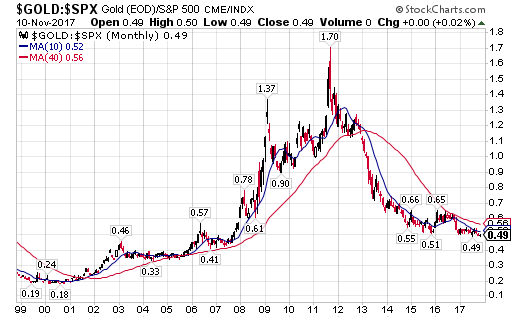
It is a relative strength chart (yes – again!), a type of chart that often leads markets but also does a good job of staying with long-term trends. Here we’re comparing monthly prices of gold with the S&P 500; bear with me as I walk through what it shows. Past performance is, as they say, no guarantee of future performance. But for the past 20+ years, this chart has performed flawlessly.
Before mid-2001, the ratio of gold ÷ S&P was moving lower, as shown by the blue and red moving averages (MAs) declining; thus, stocks were the place to be.
But by early 2002, the ratio itself was above both MAs, and both MAs were moving higher, with the shorter-term blue MAs above the longer-term red MA. This is textbook bull market stuff, meaning that gold was now the place to be, not stocks.
For the next ten years or so, that was the story: MAs moving up, blue MA higher than red MA, and the ratio itself always above the red MA. Bullish for gold. Own lots of gold, and by extension, silver, platinum, mining shares – the whole nine yards.
Fast forward to late-2013, about seven months after we issued our long-term sell recommendation on gold. (Note: While relative strength charts often lead prices, the very long time frame of a monthly chart like this one makes it more likely to be a lagging, confirming indicator.)
Prices dropped below this chart’s MAs, followed shortly by the blue MA crossing below the red MA, in classic bear market form. So it’s bye-bye gold and all the rest, hello stocks! Some four years later, that is still the picture.
Despite last year’s head-fake upwards, neither prices nor the blue MA ever broke above the red MA. The chart remains solidly in the bearish camp for gold, implying investments in stocks instead.
Mr. Russell used to say that the smart money would tend to focus either on gold or stocks at any given time, and it paid to know which they favored. So with all the other things we watch and opinions we hear about gold, add this chart to the mix, right near the top of the pile. When this chart turns bullish, whether next year or in 5 or 10 years – that’ll be the time to get into gold in a big way.


