
Not too many look at longer-term charts, but they can be very helpful in putting a market into a context; a very important step in order to determine a trading strategy and knowing the trend(s) of a market. It should be known that the larger time frame charts are more controlling than the smaller time frames by virtue of the fact that it takes more time to turn the trend of a larger time period. Some of the larger time frames are not for trading, but they are well known and used by smart money.
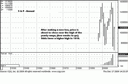
Starting with the annual chart of the S&P, when price closes at or near the high of the bar, it most always indicates a higher high for the next time frame, in this instance, 2010. Most of the time, but not always, something to bear in mind.
This annual chart suggests a higher high for 2010.
Click to Enlarge
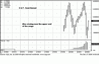
Next is the semi-annual. Somewhat similar to the annual chart, the semi-annual also suggests a higher high for the next semi-annual time frame, which is also 2010.
Click to Enlarge
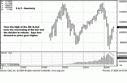
We noted how volume has been declining steadily in each quarter—not a positive sign.
Click to Enlarge
NEXT: Timely Look at S&P's Monthly and Weekly Time Frames
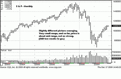
|pagebreak|What about the monthly? Oh, my! What a small bar, so far, (and recognition is given that trading is only half way through the month of December, but holidays will curtail some trading). The monthly chart reads more like a red flag for this time frame.
Price is in the ninth month of a "political" rally, (hard to pass that line up!), yet, instead of showing strength, we see a sign of weakness. The very small range, in fact the smallest of the entire move, is warning us that buyers are tired, spent, unable to move price higher.
This small range is a warning that the trend has weakened—not ended, but is showing a sign of trouble.
Click to Enlarge
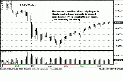
The weekly chart tells a totally different story than the larger time frames, altogether. Friday ends the week, so we do not yet know how it will close, but the point is to show how viewing the market from different times frames can put it into a context not otherwise apparent. Here, the bars at the high of the rally are small, and we just explained what smaller bars signify in an up trend. This last bar is on the low of the range, (so far), and this tells us that sellers are in control of the price action for the week.
Based on the current information, we could expect lower prices on Friday, and if they prevail, the weekly chart is telling us that time frame trend is in jeopardy.
Click to Enlarge
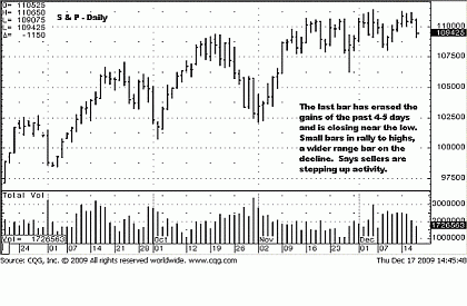
Contrary to the higher time frame charts, which suggest a new high for next year, (at least for January), the daily chart has been in a trading range for the past two months, and based on the last bar, (Thursday), the close just erased the week's effort to go higher. You can see how small the ranges are for the bars near the highs, forming resistance, compared to the last bar, which is wider to the downside, and it had higher volume than the previous five bars. A wider range on increased volume with price going lower shows ease of movement and sellers in total control. The high of this week is lower than the high of last week. If price continues lower, the daily chart will have a lower swing high and a lower low, and that will certainly change this trend from sideways to down.
What is so interesting about this exercise is that the smaller time frames are sending a signal that is a shot across the bow for the higher time frames. A change in trend always starts with the smaller time frames and works its way up to a change in the higher time frames. We could be looking at a domino effect in the making.
However, as we stated from the outset, the higher time frames are more controlling, and if that holds true, the higher time frames are saying that this potential breakdown in the trend structure in the lower time frames may not have legs, and we could see a turnaround by year end.
We also said that one cannot really trade the higher time frames, so we have to stick to the present tense activity that appears on the daily chart, with an eye to the weekly and monthly. The daily chart says a trend change is a growing probability.
The small range of the weekly chart does not present a counterargument, and almost supports what the daily chart is indicating. The small range monthly chart supports what the weekly and daily charts are showing—a sort of nestling effect, like Russian nesting dolls where one fits inside another.
Not shown, but the intraday trends are down, acting as a drag on the daily, and so far, succeeding. If the daily turns, it acts as a drag on an already weakened weekly, then the monthly—the domino effect we referenced in the title of this article.
Click to Enlarge
This should give you an idea of how important it is to know all time frames to put the price activity into a context and better know what to expect from the next higher time frame. They are all inter-related.
NEXT: So What's Likely Ahead for the S&P?
|pagebreak|Let us now watch to see which time frame is going to have the greatest impact on the other. For now, the S&P looks lower.
Well, for as much as it looked like the S&P was heading lower, it refuses to give up the protection of the current trading range. The short positions we recommended were scratched. After two days of effort, they were not showing any profit due to the poor trade location, which happened to be in the middle of the month long range.
The review of six different time frames above is helpful to keep in mind that the higher time frames are still showing strength, and not to let the smaller time frames, like the daily and intraday, be too controlling for decision making as to immediate expectations for trend movement.
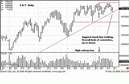
The horizontal lines frame the current trading range that started in November. The up-sloping trend line shows how the trend continues to remain above it. We have already covered how the upward thrusts have been getting shorter, a sign of weakening. It remains more of the same. What we know for certain is that it will not remain the same, and when a change occurs, it will auger a substantial move.
Click to Enlarge
Let us qualify that conclusion. If price breaks out to the upside, we are not of the mind that a move higher can/will be sustained. The Federal Reserve is bankrupting itself; it already did so to the country back in 1933. Even if it chooses to continue pumping fiat paper into the market, more and more people are willing to recognize that the "emperor is wearing no clothes." We see the upside as limited, and we fully expect the possibility of yet another failed upside probe if price does rally once again.
What we do see is the higher probability of a 100-point S&P decline, nearer to the 1007 level. That target will be adjusted if and as price drops. A point and figure calculation defines how low price can potentially go from current levels.
What has been missing in this market is supply selling. We have defined supply selling before. It is when price declines with ease of movement down, evidenced by wider bars on substantially increased volume, and previous support areas are violated. We differentiate supply selling from the word "selling" used by itself, for selling goes on all the time in the course of daily activity, but bars and volume may not increase in size as a consequence.
We placed an arrow at the high volume day, and another arrow that reflects the price activity that resulted. Volume is relative to the activity surrounding it. You can see that November's volume kept getting smaller. The four December Friday's volume spike stands out as a substantial increase, relative to the past few weeks of trading. It also marks the high of the current rally and trading range.
High volume spikes often are a transfer of risk from weak hands into strong. In this instance, strong hands are selling into weak-handed holders. Note how the level of volume has held steadily for the past few weeks, but price has not been able to extend higher with that increased effort. Smart money likes to hide what it is doing, but we contend that their activity has to show up in volume because they move such big numbers of contacts that need to be distributed over time.
When price declined 75 S&P points during the last half of October, the level of volume was about what it has been right now. We view this as part of the distribution process, smart money distributing their long positions into the hands of "other" buyers that lack staying power. This is how markets work, and it is how markets have worked on exchanges for over 100 years.
What we are seeing are the final stages of this politically-driven, Fed-fed rally that is doomed to fail, much like the doomed-to-fail policies of pumping trillions of fiat printed currency to prop up the same faltering institutions that were the cause of this financial disaster. The shell game is fast cracking. The trading range "balance" will eventually be broken, and an imbalance will ensue. It always does. It is for these reasons we gave the projections above as a target. The market never lies. It can be manipulated for only so long, and history is replete with market bubbles, from tulips to houses. Not even the devastating policies of greedy central banks around the world can hide their folly.
This article is as much editorial comment as it is technical, but the comments are made to better understand why the technical picture has been so bent out of shape, as revealed in the distorted action between price and volume throughout this rally.
The trading range is alive and well, and price will not get very far until it breaks free of it.
By Michael Noonan of Edge Trader Plus
Michael Noonan is the driving force behind Edge Trader Plus. He has been in the futures business for 30 years, functioning primarily in an individual capacity. He was the research analyst for the largest investment banker in the south, at one time, and he managed money in the cash bond market for a $5 billion pension fund using Peter Steidlmeyer’s market profile.
Proficient in Gann, Elliott Wave, market profile, etc, Mr. Noonan no longer uses any of those technical procedures. Instead, his primary focus is on developing market activity, relying solely on the information generated by the market itself, such as the interaction between price and volume, and how they relate to important price levels in the market structure. He incorporates proven market principles, such as knowledge of the trend, supply and demand, along with disciplined rules for to find developing high-probability trade opportunities.


