
We track the performance of our prop traders carefully. One of our traders went from “flagged for underperformance” to “most improved,” and eventually, to one of our better traders.
How did he do it?
I recently asked him, and here is his response:
Hey Bella,
One of the things that has really helped me has been going back and studying the charts of all of my winning trades and finding similarities in the chart patterns and taking a more technical analysis approach to my trading using ten- and 15-minute candlesticks.
For example, one of the things I noticed was that whatever chart pattern I traded, over 80% of my winning trades were made above/below the previous day’s trading range, so now I almost never take trades that are not above/below the previous day’s trading range.
I also really paid attention to the structure of the chart leading to the breakout/breakdown of the chart pattern I am trading. For example, if I am watching a stock for a morning breakout trade through highs, then some of the things I would look for in determining whether or not to take the trade are:
- Is it trading above yesterdays high?
- The candle that printed the current high of the day, did it close there or did it leave a long upper tail/wick?
- How far did the stock pull back off morning highs before attempting to breakout again; 25%, 50%, more than 50%?
- Do any inside bars get printed in upper 30% of the morning range, indicating consolidation near highs just before breakout?
- The inside bars that get printed, do they close at highs or leave tails/wicks?
- How far is the candle in relation to 5 exponential moving average? And is there support from the rising moving average?
I definitely feel that paying attention to these small little details have really made all the difference in my trading recently.
Here are some actual trading examples.
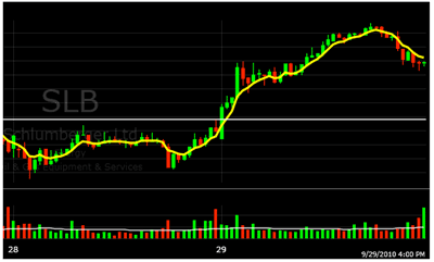
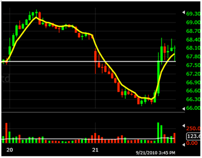
|pagebreak|I’ve attached two charts, one breakout trade on Schlumberger Ltd (SLB) on September 29, 2010 (ten-minute candle chart) and one breakdown trade on Agnico Eagle Mines Ltd. (AEM) on September 21, 2010 (15-minute candle chart). The line on both charts indicates high/low for previous day. The moving average used is the 5 exponential moving average.
Below are what my thoughts would be on what I am seeing on the charts prior to taking the trade.
1. SLB Breakout
- First candle strong, closes near high, and clearly above previous day’s high
- Second candle pulls back, leaving upper tail/wick and indicating possible reversal, but in relation to overall morning range, pullback is only about 20% off highs
- Third candle nearly erases the upper tail/wick of second candle, closes at high, and is an inside bar, indicating consolidation near highs of the morning opening range
- Third candle literally sitting on the rising 5 exponential moving average, providing support
- Would look to get long above third candle/morning high
- Watch the tape for confirmation
Click
to Enlarge
2. AEM Breakdown
- First candle trades down through previous day’s low and even though it leaves a long lower wick/tail, the pullback looks to be standard 50% retracement off lows of the morning range and candle closes below previous day’s low
- Second candle leaves long upper wick/tail and closes at low, indicating weakness
- Third candle bounces off the low again and leaves long lower wick/tail, but is unable to trade back above 50% of morning range or close back above previous day’s low (possible resistance now)
- Fourth and fifth candles close near lows with fifth candle closing on the low; also, both candles are inside bars, indicating consolidation near the morning range low
- Fifth candle near down-sloping 5 exponential moving average, providing resistance
- Would look to get short below fifth candle/low of day
- Watch tape for confirmation
Click
to Enlarge


