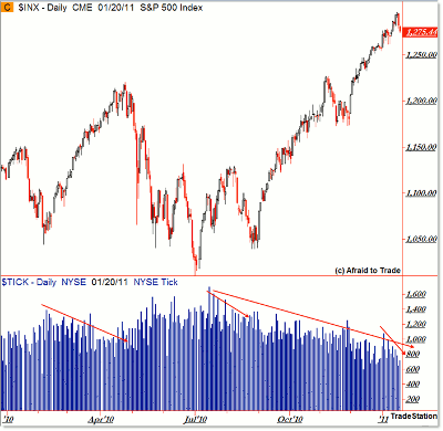
I’m a huge fan of comparing the S&P 500 with the NYSE TICK (along with volume and momentum) for confirmations and non-confirmations (divergences) as tools to get a better sense of trend strength and possible opportunities to play within that developing structure.
Just like the S&P 500, the TICK has an individual character to it, and sometimes that character changes along with market environments/conditions, particularly in times of high or low volatility.
Let’s take a look at the entirety of 2010, and slip into present day, in comparing TICK highs and the S&P 500 to see how the picture has evolved and changed up until now.
What we’re seeing above is the daily chart of the S&P 500 and the NYSE TICK ($TICK).
What I’ve done that’s unique is cut off the TICK lows so as to compare only TICK highs/extremes.
Remember that the TICK—a market internal—is the difference between stocks “ticking” up at given moment minus those “ticking” down at a given moment.
Thus, a TICK reading of 1,000 reveals that 1,000 more stocks/issues are ticking up at a moment than those trading down.
A TICK high extreme is the highest point in the day where the TICK registered a positive value. It’s helpful for confirmation/non-confirmation intraday, but you can take the insights up to the daily chart like this for a broader picture.
As might not be surprising, TICK extremes are correlated with volatility, as high-volatility market periods tend to show higher and lower TICK extremes on a session, while low-volatility periods likewise show lower, more moderate TICK extremes in a day.
Markets alternate between periods of high and low volatility—and markets tend to experience more volatility as they fall than when they creep higher. The year 2010 was an excellent testament.
Ok, so that’s the background. What’s the message now?
Article Continues on Page 2
|pagebreak|Given that the market has traveled almost straight up since bottoming in early September (save November’s retracement), volatility, and thus TICK extremes have contracted/declined during periods of sustained upside creep.
There are three specific examples of “upside price creep” accompanied by declining TICK high extremes in 2010:- The “creeper rally” from February to April (ahead of the May flash crash)
- The mini-July/August five-wave bounce from 1,010 to 1,130
- The two-step “creeper rally” from September to the present (excepting November)
In the case of the April and August peaks, the market pulled back deeply when the creeper rallies peaked and a retracement phase began.
If you look closely at the actual TICK high numbers, we see the following:- April 23, 2010 stock peak: TICK daily high was 866
- August 9, 2010 swing high: TICK daily high was 1,108
The S&P 500 pushed to a new recovery high Tuesday at 1,296 (shy of the psychologically important 1,300 number).
On that day, the TICK extreme high of the session was 783. Take a look at the recent compression (divergence/decline) in TICK highs going into that (so far) peak.
Not only was there the longer, multi-month decline, but there was a noticeable contraction of the week(s) just ahead of the peak.
Now, if the market/buyers surge back above 1,300, all bets are off and the little melt up likely continues, but until then, it’s interesting to compare prior TICK behavior/character with current realities.
Keep this 2010 comparison chart in mind and closely monitor new price data—and levels to watch—as the market moves/reacts with the 1,300 level.
By Corey Rosenbloom, trader and blogger, AfraidToTrade.com


