In trading, it’s not only important to spot trends, but also to identify when that trend is likely to stall and know what to do next, writes Maria Rinehart of See It Market.
Very early in the study of technical analysis, many become versed with chart patterns that signal a breakout or breakdown. There is the favorite cup and handle, flags, and three Buddhas, among others. However, what happens after the breakout is successful? The answer lies with your temperament and time frame. Some investors can sit patiently over time, but for many active traders, sitting through the inevitable consolidation periods can be both unnerving and impractical. Breakouts across sectors move in shifts, thus, a lengthy consolidation period can tie up resources that can be deployed elsewhere when the trend in one area has reached a peak. Therefore it is important for investors to identify when the trend will likely stall. Two methods that can assist active investors in this endeavor include Fibonacci analysis and the identification of stock price congestion zones.
Fibonacci analysis is a common method used to determine price expansion and contraction on the chart. The idea is that price in the market expands and contracts in a fairly predictive manner as spirals expand in nature (Brown, 2004). This method offers a guide to determine price targets in the market. It never ceases to amaze me how price will consistently stall at these levels. The real beauty is that when drawn well, the market is an orchestrated symphony as targets among various vehicles are reached in unison.
Another method to identify when a trend might stall is to simply observe price action and volume to identify stock price congestion zones, or what I call in a downtrend, whiplash territory. Whiplash territory seems much more appropriate in a downtrend as the price action of a falling stock tends towards more volatility than one that is calmly trending up. The method is fairly is straightforward. Look left in time and note the price level when the trade experienced heavy volume with clear winners and losers.
Take for example the chart of Apple (AAPL) on March 4. The red line was drawn to indicate at what price level the AAPL uptrend experienced an extended consolidation period with volume—a stock price congestion zone (i.e. support).
AAPL Stock Chart – Figure 1
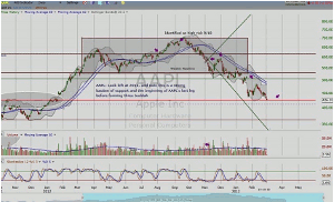
Click to Enlarge
Now turn your attention to the AAPL chart below (figure 2). This is the chart of AAPL from last week. After multiple attempts at a break through this stock price congestion support level, AAPL closed below this important support when the overall market picture weakened. A reminder that the majority of movers trend together. The next potential zone is in brown. As witnessed with other breakdowns, pessimism can quickly gain momentum as one more area of support is taken out; therefore, the brown trend line is much more suspect as an area of support as the previous one in red.
AAPL Stock Chart – Figure 2
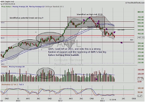
Click to Enlarge
The next two charts are of Hewlett-Packard (HPQ). Once again, the stock price congestion zone was identified by looking left and noting the volume below. HPQ would temporarily exceed this level as shown in Figure 4 (the last chart).
HPQ Stock Chart – Figure 3
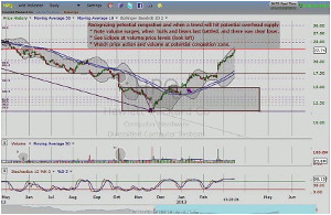
Click to Enlarge
HPQ Stock Chart – Figure 4
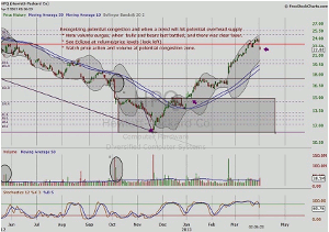
Click to Enlarge
As always, with any price-time analysis method, price action should confirm target.
By Maria Rinehart, Contributor, See It Market