
Using market valuation indicators to distinguish between overbought and oversold conditions can help you anticipate future market direction, says Stoyan Bojinov of ETFdb.com.
They say that nobody rings a bell at the market top or bottom. What separates seasoned veterans from “excited” investors is the ability to pull the trigger with conviction when others are unsure, thereby being able to better anticipate and take advantage of volatility when the theoretical bell finally does ring. Like every trading strategy out there, the only way to get better at anticipating the markets’ major turning points is to put your plan into practice and refine it constantly.
Given the sea of information out there, many are often left swimming in more data than is manageable, let alone useful. One way around this is common conundrum is knowing how and where to focus your research efforts; this is of course made easier through the use of “tried-and-true” indicators. As such, below we showcase and highlight three of the most valuable and talked about market valuation indicators out there.
1. What is the Treasury Yield Spread?
The yield spread simply refers to the difference (think “minus”) between the quoted rates on two different instruments; the value lies in comparing the risk premium for investing in one financial product over another. Comparing the 10-year Treasury yield with the Federal funds rate is a common way to monitor the bond market’s sentiment. Consider the chart below, which is constructed using quarterly yield and rate figures since 1990 from the St. Louis Fed databank:
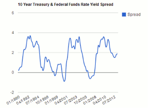
Click to Enlarge
Note how this spread started to drop sharply below the zero line in late 2000 right before the tech bubble burst and later again in early 2007 prior to the financial meltdown. This is because the yield on 10-year Treasuries has a tendency to drop before the S&P 500 (SPY) rolls over, as investors move out of risky assets and back into safe havens.
Currently, the yield spread suggests we are slowly but surely moving towards a steep correction in the markets; however, this spread can still drop while equities continue to rise, meaning investors shouldn’t base their allocation decisions solely on this indicator.
2. What is the S&P 500 P/E Ratio?
This is simply the total price of the stock index divided by the combined earnings of all the companies; it shouldn’t be terribly surprising to learn that using perhaps the most popular financial ratio for individual security analysis also comes in handy when looking at the broad market. Consider the chart below, which is constructed using annual data from Professor Shiller since 1960:
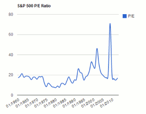
Click to Enlarge
NEXT PAGE: Market Cap to GDP Ratio
|pagebreak|Studies show that the best way to utilize this indicator is to use it in conjunction with a moving average crossover strategy, instead of simply trying to pick what looks like a high or low P/E reading by eyeballing historical data. The value of this indicator lies in helping to identify periods where the market is approaching “expensive” as well as “cheap” territory.
Click to Enlarge
When using two- and five-year moving averages, investors are alerted to be defensive when the short-term MA crosses below the longer-term one, thereby signaling that near-term growth expectations are declining below the historical norm; likewise, a bullish alert is issued when the two-year average P/E crosses above the five-year, thereby signaling that near-term growth expectations are starting to outpace the longer-term average.
3. What is the Market Capitalization to GDP Ratio?
This is the capitalization of the entire domestic stock market divided by the nation’s GDP. Essentially, this valuation indicator compares the value of all publicly traded companies as a share of the total economy. This indicator has been described by Warren Buffett himself as “probably the best single measure of where valuations stand at any given moment.” Consider the chart below, which is constructed using end-year market capitalization and GDP data since 1990:
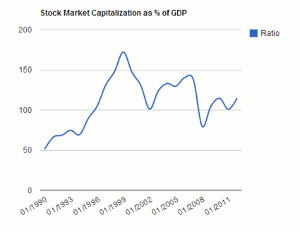
Click to Enlarge
Historically, an equity market downturn has followed when this indicator nears or surpasses the 150% level; notice how this valuation ratio peaked in the beginning of 1999 and 2006, well in advance of the stock market crashing in both instances. Fundamentally, this makes sense because it showcases that the value of stocks greatly exceeds the actual size of the economy, thereby pointing out that a “bubble” of some sort must exist. Currently, this indicator suggests that stocks still have room to run, although we are certainly approaching historically worrisome levels.
The Bottom Line
Market valuation indicators can be useful tools in helping investors distinguish between “overbought” and “oversold” conditions on Wall Street. What investors need to always keep in mind is that no single indicator can be used to predict the market’s direction with 100% accuracy every time. Because each economic scenario in history is unique, investors need to use a combination of indicators and other analysis techniques to help guide their decision in lieu of relying on one “holy grail” indicator. Using the above outlined indicators in conjugation with other proven research methods should help investors make more informed, and ultimately more profitable, decisions over the long-haul.
By Stoyan Bojinov, Contributor, ETFdb.com


