
The staff at Stock Barometer takes a look back at the money flow data for ETFs during the 2007 top to give traders a better idea of how to spot when tops and bottoms are coming in.
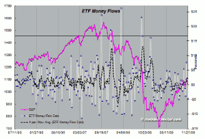
The chart below takes a look at the money flow data for ETFs back during the 2007 top.
Click to Enlarge
Observations? Again, as we've shown over the past money flow is usually a contrarian indicator. A peak in flow is usually associated with a top. The changes in the ETF landscape over the past decade has a significant impact on the signal from ETFs.
On the chart, you'll notice four peak readings. The first peak came just before (a few weeks) the 2007 top. The second peak came on the second bounce in the market that failed and really initiated the weakness. The third peak actually came at the second bottom as the market formed a secondary bounce, but again, this was the secondary b wave setting up the larger move lower. And finally, the fourth peak came just before the market fell off a cliff.
Note there's also a fifth peak, just below the black line that has no significance here. It came in as the market was trying to bottom. But the market couldn't bottom until the buyers were out...
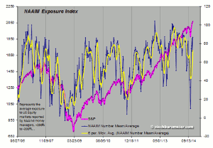
Now, if you combine this with the NAAIM data (sorry for not matching time frames), you can see some correlation.
Click to Enlarge
It's the reason we started following these two data series—to get better ideas of when tops and bottoms are coming in. So stay tuned—our job is to get you positioned right in the market and hopefully over the period of your life when you're investing, and growing your assets, the cumulative effect of more educated decisions about when to buy and when to sell, will put you in a better position.
By the Staff at Stock Barometer


