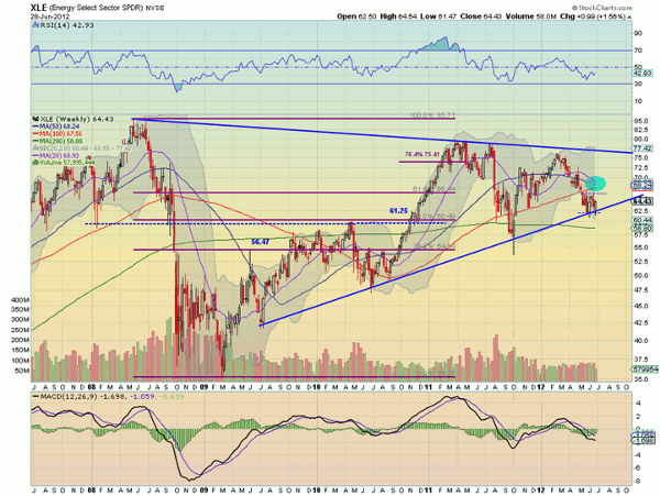
Greg Harmon of Dragonfly Capital explains why the chart of one ETF tells a story of an impending move.
The energy sector has been beaten up badly since the end of February. Now the chart of the Energy Select Sector SPDR (XLE) is showing signs that a move could be imminent.
The weekly chart, above, has at least five indicators of a pending move, but it may not be what you think.
- The price is resting on support of the bottom rail of a symmetrical triangle going back to 2008. A bounce of the rail brings a trade to the top rail at 76.50, but a crash down through it has a Measured Move to 19.20.
- The small consolidation over the last seven weeks is building a bear flag. A break down out of that consolidation brings a target first of 58.25 and then a Measured Move to 47.75.
- The 20- and 50-week Simple Moving Averages (SMA) are moving lower and are about to cross the 100-week SMA. All three tightly converging , but not running flat, can be a catalyst for a big move. The plurality of the SMAs pointing lower suggests down.
- The Relative Strength Index (RSI) is has been trending lower over the last four months, but is currently trying to pop higher. With it still in bearish territory, the bias is to the downside, but that would not preclude a pop up near 60 and failure, which would likely bring prices at least to the SMA jumble.
- The Moving Average Convergence Divergence (MACD) indicator is negative, but it has bottomed and is improving. This divergence higher is a positive for the sector, and would be re-enforced if the RSI continued higher. Look for a cross to positive as conclusive evidence that this lone indicator is correct.
None of this analysis precludes the sector from doing whatever it will do, including rallying 10% in a day. But for now, the evidence gives weight to the downside. At the very least, it gives no real reason to buy yet.
Greg Harmon can be found at Dragonfly Capital.


