

Moby Waller of BigTrends.com scanned for hot and cold sectors in early 2014 for clues on how the stock market’s performance might unfold over the year.
Taking a look at some of the year-to-date (ytd) ETF winners and losers, screened for optionable/shortable and with over 100k daily average volume, some interesting names are outperforming and underperforming the S&P 500 Index (SPX) (SPY) in the early going of 2014. We're looking at pure sector plays here, so no ultra, inverse, bear, 3x, etc. ETFs.
For a baseline, the SPYders are basically flat, down -0.3% thus far this year (the performance of the S&P 500 in January and the first six weeks of 2014 is important for setting the tone for the year's performance, but that's another analysis).
We're using long-term weekly charts for the four ETFs discussed below to see the big picture encompassing the past several years.
At the top of the list with big gains of 23% and 22% already in this new year are SPDR Biotech ETF (XBI) and Market Vectors Junior Gold Miners ETF (GDXJ).
Two different stories here, as biotech (both XBI and IBB) have been in long bullish trends that we've discussed and traded many times on the way up—gold and precious metals (and miners) have been in a strong downtrend but are perking up recently.
Note the XBI chart, first below—this is in danger of going parabolic currently, as the uptrend has accelerated in recent weeks to what looks like an unsustainable level. A pullback would be expected and healthy at this point. As we mentioned, biotech has been one of the best sectors since the 2009 market bottom (and recovered losses from 2007 quicker than most all other sectors as well)—so banking on a huge downmove isn't a smart bet at this point—but the slope of that uptrend is not likely sustainable.
XBI Weekly Chart
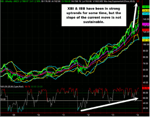
Click to Enlarge
Next looking at the big picture in GDXJ—you can see the current rally is just a blip compared to the big downtrend from 2011 to 2013—it went from 180 to 29 basically. Just placing a simple Fibonacci retracement on this downtrend from high to low, the first retracement target is all the way up at 64.37. So there is huge potential for a rebound here—however, keep in mind that the on this longer-term basis, percent R is still in the bottom half of its range for example. You can see on the chart that several rally attempts were stunted with percent R not even re-taking mid-levels. On a shorter-term basis, there are multiple downtrends within this overall huge trend, and those have retracement possibilities as well on a more realistic scale. For example, the late August 2013 high to December 2013 low encompassed a drop of nearly 26 points in GDXJ, it has since retraced some of that on the current bounce, but hasn't yet reached 41.69 which would be a 50% retracement.
GDXJ Weekly Chart
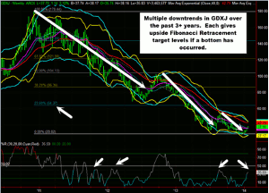
Click to Enlarge
NEXT PAGE: Lagging Sectors
|pagebreak|On the underperformers list for 2014 YTD, we see ETF names such as iShares MSCI Turkey ETF (TUR) and iShares China Large Cap ETF (FXI)—two individual country names, down 7% each already in 2014.
The nice thing with ETF trading is that there is such a wide variety of variation in performance, and this holds true even among the singe country international ETFs…for example, Germany and Japan have been outperforming in the near-term.
Taking a look at the long-term TUR chart, you can see below that it's largely been range-bound over the past 4+ years. 44 and 40 have been key bottoms in the range—and we are right around one of those levels now. But you must keep in mind that the technical picture on TUR is negative—however if you are so inclined, you could bank on the range holdings its long-term lows in the 40/44 area (note that in the 2008 crash it did break below this range). We would prefer to see it stabilize and bounce from the bottom of this range before just guessing that it will hold, due to the negative technical picture.
This TUR chart could also be viewed under the scope of what long-term technical pattern is being formed (double-top, triple bottom, etc) but we'll leave that for another article.
TUR Weekly Chart
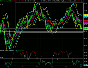
Click to Enlarge
China ETF (FXI) has been one of 2014's losers thus far—this may be surprising to some people who assume that the BRIC countries such as Brazil, India, and China will power the global economy in the 21st century. And while that may end up being true, in the shorter-term, each is its own economy and stock market with their own problems and setbacks to deal with.
FXI is range-bound long-term just as TUR is. These two countries’ fortunes and economies are normally linked or correlated strongly in general. But you can see on the FXI chart below that since the 2009 recovery, FXI has traded in a fairly narrow range between 31.50 and 46. More recently since mid-2011 the upside of the range has narrowed further to roughly in the 31 to 41 range. FXI is right around the middle of that range currently and right around key mid-levels on the long-term percent R. In general on this ETF should this tight range continue, we might look to other China ETFs that have more price movement on them for our shorter-term options trading.
FXI Weekly Chart
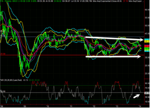
Click to Enlarge
Will biotech continue its accelerated uptrend? Will the bounceback in gold miners and precious metals continue? Will the emerging markets and BRIC countries underperform again in 2014? These are some of the key trends going on in the stock marketplace that will be unveiled through the performance of ETFs and individual companies in the weeks and months to come.
Moby Waller, Co-Portfolio Manager, ETF Tradr Program & Rapid Options Income, BigTrends.com


