
The advance slowed, notes Bonnie Gortler of bonniegortler.com.
Only three S&P SPDR sectors were higher last week, with Consumer Staples (XLP) and Utilities (XLU) the best sectors, while Communication Services (XLC) and Materials (XLB) were the worst, with the SPDR S&P 500 ETF Trust (SPY) falling by -1.13%.
S&P SPDR Sector ETFs Performance Summary 8/12/22 – 8/19/22
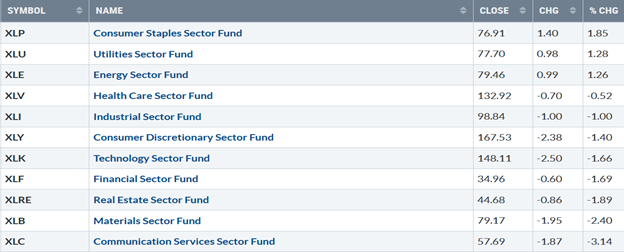
Source: Stockcharts.com
Figure 2: Bonnie's Mix of ETFs Performance Summary 8/12/22 – 8/19/22
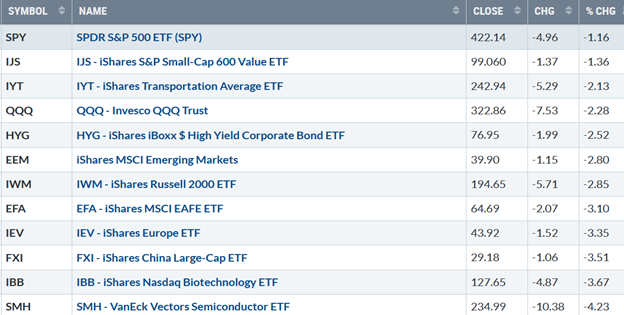
Source: Stockcharts.com
Investors shifted to risk-off last week, with buyers turning to sellers. Technology, Semiconductors, Hi-Yield Bonds, and Small Cap Growth stocks were under selling pressure. International markets, including Europe, China, and Emerging Markets, reversed lower, weaker than the US market failing to gain momentum after joining the rally the previous week.
Figure 3: UST 10YR Bond Yields Daily
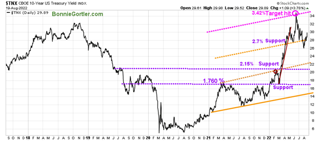
Source: Stockcharts.com
The 10-Year US Treasury yields (TNX) rose to close at 2.989% last week. Support remains at 2.70%, followed by 2.20%. Resistance is at 3.20% and 3.40%.
The major averages stalled at overhead resistance. The Dow was the strongest, down slightly -0.16%, S&P 500 down -1.21%, snapping a four-week winning streak, and the Nasdaq, the worst performer, down -2.62%. The Russell 2000 Index fell the most, -2.94%, while the Value Line Arithmetic Index (a mix of approximately 1700 stocks was down by -2.08%.
Weekly market breadth no longer improved and was negative for the New York Stock Exchange Index (NYSE) and Nasdaq. The NYSE had 904 advances and 2588 declines, with 145 new highs and 104 new lows. There were 1675 advances and 3543 declines on the Nasdaq, with 270 new highs and 239 new lows.
Figure 4: Nasdaq Advance-Decline Line (Daily)
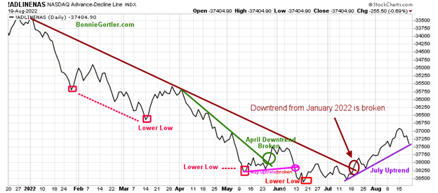
Source: Stockcharts.com
There was an improvement in breadth at the end of May and early June after breaking its April downtrend (green line), but it was short-lived, followed by weakness in Nasdaq.
Since July, market breadth had steadily improved after breaking the January downtrend (brown line), leading to a powerful advance in the Nasdaq until last week.
The Nasdaq AD line remains in an uptrend (purple line). However, further weakness would break the uptrend and lead to a short-term correction in Nasdaq. On the other hand, a turn up taking out the high would be positive.
Figure 5: CBOE Volatility Index VIX
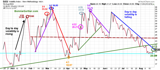
Source: Stockcharts.com
The CBOE Volatility Index (VIX), a measure of fear, has been trading above 20.00 for most of 2022. In January, VIX made a high at 31.96 on 1/26 (brown circle), on 3/1 at 33.32 (red circle), and peaked at 36.95 on 3/07 (blue circle).
VIX turned up last week as the major averages fell, closing at 20.60 (green circle). If VIX rises early in the week above 24.00 (brown dotted line), look for intra-day volatility to rise and a sign that the latest short-term pullback is likely to continue. On the other hand, a turn down below 20.00 would likely lead to higher prices.
Figure 6: Daily New York Stock Exchange (NYSE) New Lows
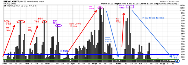
Source: Stockcharts.com
Watching new lows on the New York Stock Exchange is a simple technical tool that helps awareness of the immediate trend's direction.
New lows warned of a potential sharp pullback, high volatility, and "panic selling" for most of 2022, closing above 150. As the market started to move lower in January 2022, new lows rose sharply, peaking at 792 on 1/24 and again on 2/24 (red circles), implying an increased risk of further selling pressure. Investors in early May unloaded stocks, and new lows expanded to 1063 on 5/09 (pink circle), then on 6/16 (purple rectangle), new lows made a new high of 1092.
Learn more about the significance of new lows in my book, Journey to Wealth, published on Amazon.
New lows contracted in June and no longer are in the high-risk zone above 150.
New lows closed at 57 on 8/19 (light blue circle), indicating a low risk of a significant decline. However, they did rise last week and are no longer below 25, the lowest risk zone. It would be encouraging if new lows contracted immediately early in the week.
On the other hand, a warning would occur if new lows increase to above 150, then I would expect further weakness.
Figure 7: Daily iShares Russell 2000 (IWM) Price (Top) and 12-26-9 MACD (Middle) and Money Flow (Bottom)
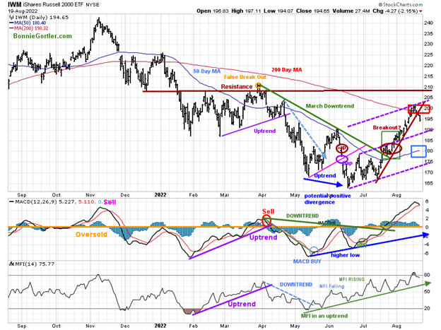
Source: Stockcharts.com
The top portion of the chart is the daily iShares Russell 2000 Index ETF (IWM), the benchmark for small-cap stocks, with a 50-Day Moving Average (MA) (blue line) and 200-Day Moving Average (MA) that traders watch and use to define trends. At the end of March,
IWM failed to break out above resistance at 210.00 (orange circle) and turned down, forming a downtrend (green line). In late July, IWM broke its March downtrend.
IWM broke below its steep uptrend (brown line), falling by -2.85% last week, closing at 194.65, down more than the S&P 500. IWM remains above the 50-Day Moving Average (blue rectangle) but not above the 200-Day Moving Average (red rectangle), which could slow the interest of investors to add to small caps.
Short-term resistance is 200.00, 204.00, and 210.00, with support of 193.00, 190.00, 180.00, and 175.00.
MACD (middle chart) remains on a buy but is now close to giving a sell. It’s been a strong rally off the lows, with MACD breaking the momentum downtrend from April, rising above 0, and making higher highs. This bodes well for a second rally attempt following the completion of the latest decline, but no guarantee.
Money Flow (lower chart) broke the April downtrend (dotted blue line) and has accelerated. It turned down from the highest reading since the April peak and remained in an uptrend.
The IWM Intermediate Trend Remains Positive
Figure 8: Weekly iShares Russell 2000 (IWM) Price (Top) and 12-26-9 MACD (Bottom)
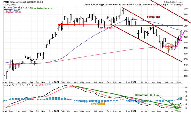
Source: Stockcharts.com
The Russell 2000 (IWM) closed above its price downtrend from November 2021 (brown line) three weeks ago, shifting the intermediate trend to up.
IWM stalled below the 50-Week Moving Average. Resistance is at 210.0, followed by 220.00, and support is at 190.00 and 180.00. Upside target 228.00.
MACD (bottom chart) is on a buy (green circle) along with breaking the downtrend from March 2021 (green line). The worst of the downside momentum is likely completed.
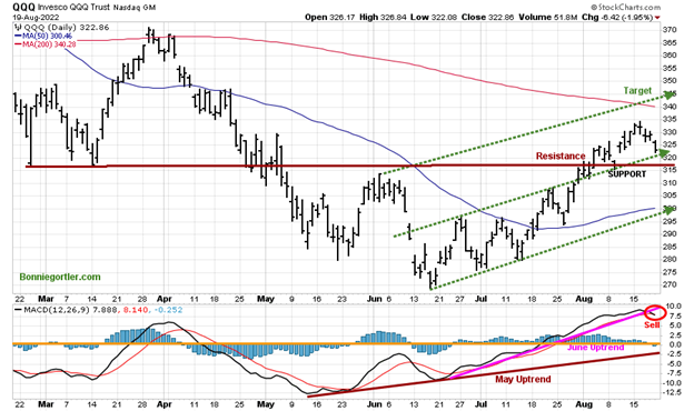
Figure 9: Daily Invesco QQQ Trust (QQQ) Price (Top) and 12-26-9 MACD (Bottom)
Source: Stockcharts.com
The chart shows the daily Invesco QQQ (QQQ), an exchange-traded fund based on the Nasdaq 100 Index. The two top holdings in QQQ are Apple (AAPL) and Microsoft (MSFT), with over 20.00%. The direction of both these stocks will impact the direction of QQQ.
QQQ fell -2.28%, closing at 322.86 last week, above resistance, which is now acting as support (brown line). QQQ's upside target remains at 340.00.
Support is at 320.00, 317.00, 310.00, and 300.00.
The bottom chart is MACD (12, 26, nine), a measure of momentum; MACD gave a sell after a pattern of higher highs. No negative divergence has formed as QQQ made higher highs which is positive. The first decline is likely not to be a significant pullback followed by another rally attempt toward the upper channel (top green dotted line).
Figure 10: Weekly Invesco QQQ Trust (QQQ) Price (Top) and 12-26-9 MACD (Bottom)
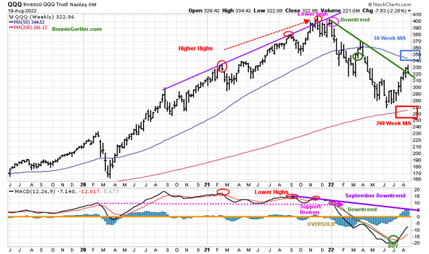
Source: Stockcharts.com
The top chart shows the weekly Invesco QQQ Trust (QQQ) making higher highs peaking in November 2021 (red circles) but failing to make a new high in December 2021, followed by a beginning of a downtrend.
The downtrend was broken on 8/12, but QQQ had no followthrough to the upside last week, stalling below a downsloping 50-Week MA. The intermediate trend remained up despite the decline last week.
MACD (lower chart) remains on a buy breaking the downtrend from January, which implies downside momentum has slowed.
I would like to see QQQ hold above 310.00 and then close above last week’s high of 334.42.
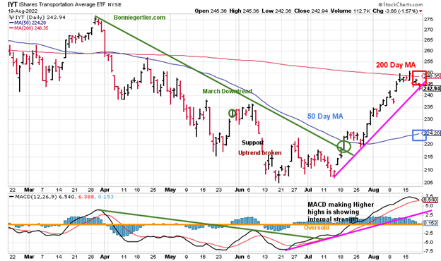
Figure 11: iShares Transportation Average (IYT) Price (Top) and 12-26-9 MACD (Bottom)
Source: Stockcharts.com
The Transportation Average (IYT) broke its price downtrend from March (green circle) in July and then consolidated near the 50-Day Moving Average before moving higher.
IYT stalled at resistance and turned lower, down -2.13% last week. Resistance is at 249.00, and support is at 240.00, 235.00, and 224.00.
MACD remains on a buy, above 0, making higher highs, but any weakness will give a sell. However, it would be a short-term positive if IYT shows strength and leads the market higher.
Figure 12: Weekly Invesco Agriculture Fund (DBA) (High Risk) Price (Top) and 12-26-9 MACD (Middle) and Money Flow (Bottom)
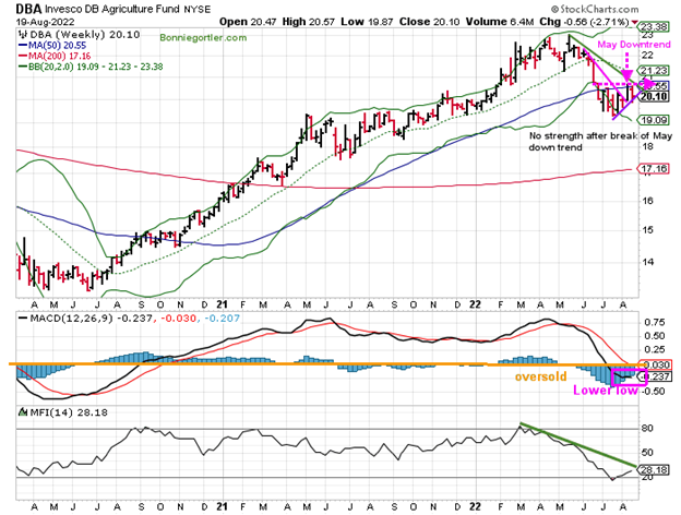
The Invesco Agricultural Fund (DBA) broke the steep May downtrend (pink line) but stalled down by 2.71% last week, closing at 20.10. It was one of the few gainers on Friday, up 0.95%
MACD has flattened, but no buy as of yet, but it could occur soon if DBA shows strength.
MACD made a lower low last week along with weakness in other commodities. To manage risk, if you invested in DBA, keep a tight stop and close your position if DBA closes below 19.80.
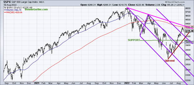
Figure 13: The S&P 500 Index ($SPX) Daily
Source: Stockcharts.com
The S&P 500 (SPX) fell by -1.21%, closing at 4228.48, stalling below the January downtrend (pink line) and the 200-day Moving Average. A close above both would be bullish and attract more buying from institutions.
Support is at 4100.00 followed by 4000.00. It will be favorable if SPX has enough strength to break the January downtrend of 4400.00.
What to Keep an Eye on This Week for Direction?
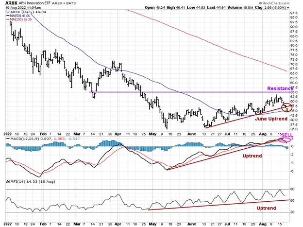
Figure 14: Daily ARK Innovation (ARKK) Price (Top) and 12-26-9 MACD (Middle) and Money Flow (Bottom)
Source: Stockcharts.com
ARK Innovation (ARKK) is an actively managed ETF by Cathie Wood that seeks long-term growth and is highly volatile.
ARKK reversed sharply from its lows in June through August, and on Friday, 8/19, ARKK broke its June uptrend (brown line), failing to penetrate above resistance (purple line).
MACD, after continuous higher highs, is now on a sell. Risk has increased of a pullback.
Money flow (lower chart) uptrend (brown line) remains intact.
Be alert to the possibility of 10% swings in both directions at any time. With MACD on a sell and the uptrend broken, it’s wise to protect your profits and reduce your holdings if you have investments.
Figure15: APPLE (AAPL) 60 Minute Price (Top) and 12-26-9 MACD (Bottom)
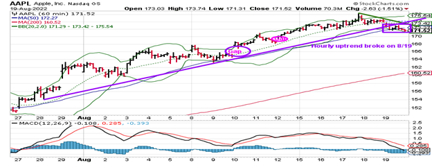
Apple, the largest holding in QQQ, has led technology higher since the June low.
Be alert that AAPL broke its hourly uptrend from July 28 on Friday, 8/19.
MACD is oversold, below zero. A turn-up above 174.00 would be positive, and below 170.00 would be short-term negative.
Summing Up:
Market breadth weakened in combination with uptrends penetrated. Short-term technical indicators have turned down from overbought readings. Previous resistance is now acting as support that needs to hold. Despite the decline last week, another rally attempt cannot be ruled out after the latest pullback is complete. Let the price action determine the direction where the market will go.
Remember to manage your risk, and your wealth will grow.
I would love to hear from you. If you have any questions or comments, email me at Bonnie@Bonniegortler.com.
Disclaimer: Although the information is made with a sincere effort for accuracy, it is not guaranteed that the information provided is a statement of fact. Nor can we guarantee the results of following any of the recommendations made herein. Readers are encouraged to meet with their own advisors to consider the suitability of investments for their own particular situations and for determination of their own risk levels. Past performance does not guarantee any future results.