We have had a massive run in the US market since the 2020 bear market bottom. Although the wall of worry has been our constant companion on the way up, markets have continued to climb it no matter how big it has gotten, explains Jack Forehand, market strategist and editor of Validea.
The rise in the market, and the rise in valuations that have come with it, has led many to conclude that we are in the second coming of the tech bubble. And they see the ending here as similar to what it was then. Others see valuations as more justified given the low-rate environment and the big growth in earnings we have seen in recent years.
Given that we are coming into year end, I thought now would be a good time to revisit our market valuation tool to look at where things stand, and some interesting things going on beneath the surface.
But before I do that, I wanted to first cover two caveats I always put in articles about market valuation. The first is that market valuation has essentially zero predictive power over short-term market returns. So the fact that the market is expensive (or cheap) tells you nothing about what it will do in the next year.
Where valuations can have some predictive power is in providing an indication of the long-term returns we can expect. Above average valuations typically lead to below average long-term future returns and vice versa.
The second caveat is that we use median figures when we look at market valuation. A median is calculated by simply ranking all stocks based on each valuation metric and then selecting the valuation that ranks right in the middle of the distribution.
Since our models select from a universe of all stocks, we like to use data that looks at the valuation of the average stock in that universe and how that changes over time. But this type of data offers no value in looking at the valuation of market cap weighted indexes like the S&P 500 or the market as a whole. For those types of indexes, the large companies are much more important to their valuation than the small ones, so median data is not useful.
With that all being said, on to a look at the current valuation data.
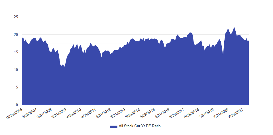
This is a graph of the median current year PE of all stocks in our investable universe (market cap greater than $150 million and daily dollar volume greater than $2 million) and how it has changed over time.
Source: Validea’s Market Valuation Tool
The value currently sits in the 65th percentile, or a little bit above the average over the full period. That may seem to make little sense given all the talk about all time high valuations, but there are two important points to keep in mind.
First, going back to what I said earlier, this is an indication of the valuation of the average stock more than the market as a whole, and so the overvaluation in the largest stocks doesn’t have nearly the impact on this that it does in the valuation of something like the S&P 500. This chart is an indication that the valuation of the median stock is much lower than the valuation of market-cap weighted indexes.
The second thing this shows is that earnings growth has been strong. Although the market has had a slight pullback, most of the decline at the end of the chart has been driven by growth in earnings, not declines in price.
So is the average stock much cheaper than many of us think? Maybe, but there are always two sides to every argument. The next two graphs will illustrate what that other side is in this case.
One trend we have seen in recent years is a rise in the number of companies that lose money. Negative earners as a percentage of our total stock universe have been consistently rising. About 27% of our universe currently has a negative current year earnings estimate. That number was 13% back in 2015. That poses a problem for the calculation of a median because if you are ranking stocks based on their PE ratio, it is difficult to rank stocks that don’t have one.
To illustrate the impact of this, think about a world where the stock market had 100 stocks, but 95 of them had negative earnings. In this world, the median PE would be calculated using only the 5 stocks left. That median could be very low, or it could be very high, but either way a strong argument could be made it isn’t a good reflection of the universe.
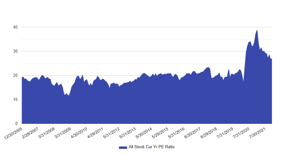
That is obviously an extreme example, but to see how it works with the current market, let’s recalculate the median, but now rank the stocks that have negative earnings at the end (i.e treat them as expensive).
Here is what you get.
Source: Validea’s Market Valuation Tool
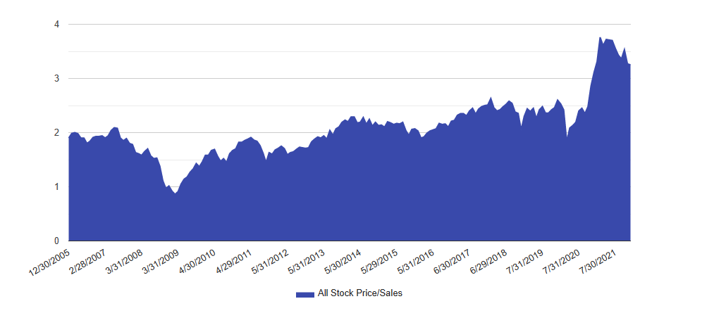
The PE rises from 18 to 27 and the percentile rises from 65th to 90th. When looked at this way, the average stock looks much more expensive. Using Price/Sales — seen in the chart below — paints a similar picture.
Source: Validea’s Market Valuation Tool
Looking at valuations relative to sales gets around the negative earner problem (since sales are never negative). And when that is coupled with the fact that margins are near all-time highs, the average stock looks very expensive on a Price/Sales basis (currently 94th percentile).
So what does all of this mean? As I said earlier, it means very little in terms of the valuation of market-cap based indexes, or with respect to where the market is going next year. But it does show that there are a significant number of companies beneath the surface that are much cheaper than the market as a whole. Which leads us to our next chart.
Is the Value of Value a Value?
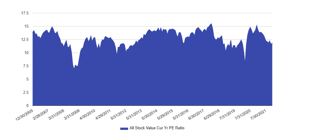
Even, though the market as a whole is expensive, there is some good news for value investors (at least if you are one of the people like me who still thinks valuation will eventually matter again)
On an absolute basis, value stocks look relatively cheap (currently in the 30th percentile)
Source: Validea’s Market Valuation Tool
And relative to growth, they are now nearly back to the same levels they reached at the pandemic low (they currently sit in the 2nd percentile)
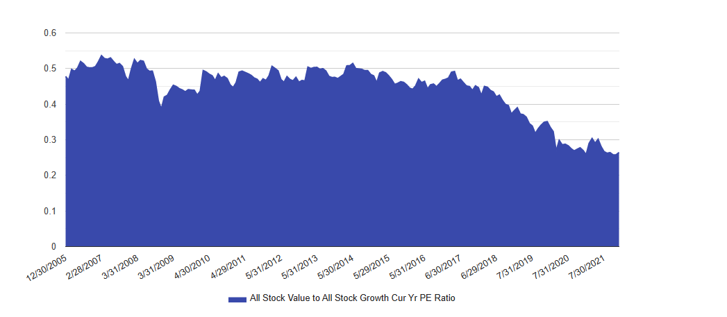
Source: Validea’s Market Valuation Tool
Unfortunately for those of us who are value investors, this doesn’t tell us much about when value will come back into favor, but if you are a believer in historical data, it does say that the odds are good for above average long-term returns for value relative to the market.


