
The daily range of any market, be it an individual stock, exchange traded fund (ETF), or a stock market index, is identified as the difference between the high and the low of the trading session. This difference is commonly referred to as the trading bar. The length of a trading bar, in reference to the trading bar that came before it, determines the momentum within the trend. In an uptrend, lengthening bars indicate an increase in buying momentum and signals that price is accelerating upward.
Bars that are getting shorter during an uptrend indicate a lack of buying momentum and signals that the upward price movement is decelerating. In a downtrend, lengthening bars indicate an increase in selling momentum signaling an acceleration of price in the downward direction. Bars that are getting shorter in a downtrend indicate a lack of selling momentum and signal that the downward price movement is starting to decelerate.
In an uptrend, price will normally start to decelerate before the direction of the trend ends and a new trend in the opposite direction begins. In a downtrend, a lack of downward momentum usually occurs before the market reverses upward. Let's see how this works by studying at Figure 1.
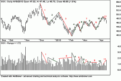
Figure 1 shows the daily trading bars for Market Vectors Gold Miners ETF (GDX). This chart shows 11 short-term trends starting from the early-December 2009 peak. Six of these short-term trends are downtrends and five are uptrends. Note that I have added lines from the highest close to the lowest close of each of the short-term trends to help identify these trends. I have also color-coded the downtrends with red lines and the uptrends with green lines and have identified each trend with a number. Below the price chart is a chart of the length of each daily trading bar. This chart looks like a volume bar chart, but it is not. It is a de-trended chart simply showing the length of each trading bar. Note that the red and green lines, as well as the numbers, all agree with the price chart.
Click to Enlarge
FIGURE 1: GDX, DAILY Graphic provided by: AmiBroker.com.
Note that during short-term downtrend 1, the length of the trading bars shortened. This indicates that there was a lack of selling momentum during this downward wave, signaling a reversal back upward. Note that during short-term upward trend 2, the length of each trading bar also grew shorter. This also shows a lack of price momentum on the part of the buyers, signaling a reversal back downward. So during trends 1 and 2, there was a lack of buying and selling momentum in the market.
However, look at what happened during short-term wave 3. During this downtrend, the length of the trading bars started to increase, signaling that selling momentum is now increasing. During uptrend 4, again, the daily trading bars grew shorter, indicating a lack of buying momentum in this market. During downtrend 5, the bars again grew longer, indicating an increase in selling momentum.
Note that selling momentum is now increasing during the downtrends and buying momentum is decreasing during the uptrends. Again there was a lack of buying interest during upward waves 6 and 8 and an increase in selling interest during downward waves 7 and 9. Up to this point, selling momentum increased during the downtrends while buying momentum decreased during the uptrends.
Things changed a little during upward trend 10. During trend 10, the trading bars started to increase, signaling a rise in buying momentum. Downtrend 11 is yet incomplete, but given the data available, it appears that selling momentum is once again on the increase.
From this analysis of "reading the bars," it has been shown that comparing the length of each trading bar in relation to those that come before the momentum of the individual short-term trends can be determined. This analysis showed that during downtrend 1 and uptrend 2, neither the buyers nor the sellers were interested in accelerating their buying or selling. However, things changed during downward wave 3. During this short-term downward trend, the length of each trading bar started to increase during the progression of the trend, indicating that selling momentum started to increase. This increase in selling momentum then carried through with each succeeding short-term downtrend, indicating that there is more interest in selling the market off than in buying the market higher. This is a characteristic of a market that wants to go lower and not higher.
While price charts in the newspaper and online stock charts and charting software do not typically show the de-trended price bars, some charting software programs have the capability for writing scripts to produce such charts, as I have done here. By being able to view the de-trended bar chart, it is possible to see what is not so obvious by looking at a typical price chart alone. Looking at the de-trended price bars and comparing their lengths with respect to the length of the bar that came before makes it possible to identify when buying or selling momentum begins. This information can then help to forecast the future direction of the market. By looking at the chart of GLD in Figure 1, it may not be obvious that the trend is downward. However, once we have identified that momentum is on the side of the sellers and not the buyers, it becomes obvious that there is a high probability that the future direction of this market will be downwards and not upwards.
By Alan Northam of TradersClassroom.com


