
Readers can access Part 1 and Part 2 using the links provided.
Today, let’s take a closer look at these lines of opposing force.
I have been a professional trader for nearly 40 years now. When I began trading, the personal computer not been invented, so software-based charting packages were not available. In the early 1970’s, there were a handful of companies that published comprehensive chart books that came out every Friday afternoon. Most professional traders either subscribed to the services and had them delivered by mail on Saturdays, or picked them up at a bookstore late on Friday afternoons.
Some traders kept their own charts by hand. I was taught to hand chart at a very early age by one of my older brothers, who traded commodities. I continue to hand chart to this day. It's one of the routines that I use in my preparation each day.
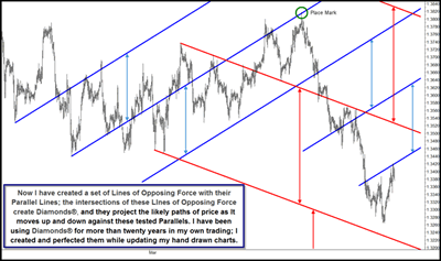
More than 20 years ago, I began to notice that some of my more effective charts had both up- and down-sloping lines, and both sets of lines had important roles in defining the probable path of price. I did extensive research on these lines of opposing force and they quickly became one of my tools of choice. I named them Diamonds® because of the space formed when lines of opposing force are overlaid on the same chart. Though I have been using them successfully for more than 20 years, this is one of the first presentations of my proprietary work with Diamonds®. In fact, this is also one of my first public presentations of Action Reaction Lines and the theory behind them.
Click to Enlarge
If you look carefully at the top of the chart, you'll see that I marked a pivot that touches the up-sloping blue center line with a circle. This will help us keep track of where price and time is as we move on to the next chart.
Click to Enlarge
You can see that price sold off hard, and looking closely at the large swing down, you should be able to tell that price found support and resistance at both lines of opposing force and their projections. In essence, using Diamonds® adds a fourth dimension to traditional three-dimensional charting. Diamonds® will give you a very accurate probable path of price if your center lines reflect frequencies of price. Once you've set up your Diamonds®, look for repeatable entry setups that you know have likely profitable outcomes.
Action Reaction Lines and Diamonds® require the use of strict money management. When you add the second layer of Action Reaction Lines, you will find many more interactions of price with tested lines. At times, you will be buying against down-sloping lines and selling against up-sloping lines—something I rarely do when using Median Lines. It is imperative that you master these tools before using them with real money in your trading account, and more importantly, you must use surgeon-like money management skills to limit your risk. I was taught many of my money management skills by Bruce Kovner while I was a money manager and mentor at Commodities Corporation, and I urge those who would try to master these tools to work hard on their self discipline and money management skills.
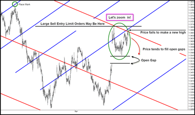
Once the long wave lower is finished, Price corrects and begins to move higher, but then it heads lower again; but note that it does not make a lower low. Price then begins a vertical move higher and gaps significantly higher one weekend when the markets are closed. Price tries to trade lower, but is unable to fill the gap. Once it fails to fill the gap and turns higher, I start to pay particular attention, because an open gap is an unusual event on a long-term chart. Price generally comes back to fill gaps.
The last major swing high tested the red, down-sloping Reaction Line and then traded lower. Price is now testing the intersection, or confluence, of a red, down-sloping Reaction Line and a blue, up-sloping Reaction Line. I call these areas where lines of opposing force meet Energy Points and find that when price interacts with these Energy Points, either a change in trend or an acceleration of the ongoing trend occurs.
Price stopped at the Energy Point and then turned lower, but note that price failed to break above the prior major swing high. Just as the unfilled gap caught my attention, the inability of price to climb above the prior major swing high alerts me that there are probably significantly large limit sell entry orders, meaning large traders are looking to enter short positions in this market and have left their orders at or near the last major swing high.
As a place marker, note that I've drawn an ellipse. Next, we’ll zoom in on this area and take a closer look.
More tomorrow in Part 4…
I wish you good trading!
By Timothy Morge
timothymorge@marketgeometry.com


