
Don Dawson of Online Trading Academy explains how two types of futures charts can often confuse traders.
A variation on charting the Commodity Futures markets is using a continuous or nearest futures contract type of chart. To many they might seem to be the same type of chart, but we will examine these two charts and see the differences.
When trading futures, we have to be able to plot the data on charts just like we do in the stock or forex markets. This allows us to make informed decisions on where to place our buy and sell orders.
However, unlike the stock and forex markets, the futures markets have to deal with contracts that expire. This means a different type of chart must be used to include the expiration of these markets.
In earlier articles, I had mentioned contract-specific charts. These charts simply plot the life of the contract. Data is collected on these charts from the first trading day of the contract all the way up to the last trading day.
These charts do a good job of giving accurate price levels because there are no adjustments made to the chart nor are there any expirations to deal with. Unfortunately, these charts can have some limitations also.
When viewing these contract-specific charts, you first notice that there is a contract high and low. If the supply-demand balance of this market gets out of balance enough, it will force prices through these highs or lows. Once this occurs, we have no reference points for creating potential trading opportunities because this particular contract has never traded at these levels before.
Another problem you may encounter is the lack of liquidity before the market becomes a front month contract (highest volume and open interest). Before the market has good liquidity, your chart may not have adequate candles to create market decisions.
To overcome this issue, chartists have come up with futures charts that are spliced onto one another as each contract expires and the next contract month begins, to have the majority of volume in it. There are two styles of these charts:
- Continuous Charting
- Nearby Charting
The charts most futures traders are familiar with are the nearby charts. As the futures market that is being charted gets close to expiration, the contract is rolled over (volume leaves one contract month and goes to the next contract month out).
In the case of the soybean meal market, the majority of the volume and open interest is currently in the July contract (making this the front month). On June 29, we had a First Notice day and all speculators were required to exit their July soybean meal positions. If they felt the market would continue in a certain direction, then they could enter the August contract (the new front month) by entering a new position in August soybean meal.
This rollover affects the charts we use to trade with. Once the First Notice day occurs on June 29 and the majority of volume leaves the July soybean meal contract for the August soybean meal contract, the July contract still trades for another ten days before expiration. This lack of liquidity in July soybean meal will start to show up on our charts as dots and dashes, instead of full-bodied candles like we are accustomed to seeing.
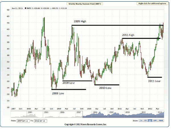
Charting software is aware of this rollover issue, and to compensate for it they will start plotting the August soybean meal contract prices onto the old July soybean meal data ten days before the July contract expires. This creates a nearby continuous Futures contract chart. Figure 1 illustrates a nearby weekly soybean meal chart:
Click to Enlarge
Now we can view a futures contract almost as though it had never expired. With continuous charts, we can go back for many years—40 years in some cases—to find extreme moves of a particular commodity futures market.
The other type of futures chart is called a continuous chart. The big difference between a continuous and a nearby futures chart is instead of attaching the next month on to the chart, we will only connect the particular month we are interested in seeing.
Confused yet? Hang in there, I will explain this.
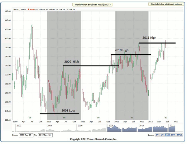
Figure 2 is going to show us a continuous chart using just the December soybean meal prices:
Click to Enlarge
Figure 2 illustrates how splicing just the past December contracts only to a chart can paint a different picture. Had this been an August weekly continuous contract, all we would see on the chart are all the past August contracts.
Unlike the nearby, which adds all the contracts that trade during the year to a chart, the continuous only applies a specific month of the commodity. Every January, the contract month chosen begins plotting for that year. Then come December, the following year’s contract month starts plotting—all the same contract month; just different years.
I like looking at these continuous contracts to see how a particular market is trading compared to its previous year's contract. By looking at just the December contract, as in Figure 2, we are comparing apples to apples. Since commodities are so cyclical, it makes sense to see what a specific month is trading like compared to its previous year of the same contract month.
I placed lines on these charts just to give you samples of some of the different ways these charts can appear. Notice in Figure 1 how the 2011 high has been decisively broken, while Figure 2 is showing how the December soybean meal is struggling to get through its December 2011 contract high.
The all-time high in Figure 1 (nearby) was approximately $455, which could have been made during a different month than a December contract. Figure 2 (continuous) shows us that the all-time high for “any” December contract is about $430.
As prices approach these all-time highs, it is nice to know if the new high is simply a case of a nearby chart being spliced together with so many different months, or if it is an actual lifetime high for a particular month of a commodity.
Read the conclusion of this article here.
Don Dawson can be found at Online Trading Academy.


