
Using three real-word examples, Jeffrey Kennedy of ElliottWave.com shows how the head-and-shoulders pattern can anticipate dramatic price moves.
You've probably never heard the words “mint chocolate chip” and “head-and-shoulders pattern” uttered in (nearly) the same breath.
But for EWI's senior commodities analyst and Futures Junctures Service editor Jeffrey Kennedy, those apparently unrelated phrases do indeed have something in common—namely, they are two of Jeffrey's favorite things in the whole wide world: first, his favorite flavor of ice cream, and second, his favorite old-school chart pattern of technical analysis.
No need for me to elaborate on mint chocolate chip. But if you're wondering what's so great about head-and-shoulders...
...For starters, the pattern is visually striking, thus easy to recognize:
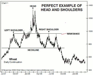
Click to Enlarge
It consists of two peaks for shoulders, separated by a higher peak (i.e. a new price extreme) for the head. The trendline that connects the lows between the left shoulder and head, and the head and right shoulder, form what is called the neckline.
Best of all, the head-and-shoulders pattern has a built-in formula for calculating critical resistance and a likely objective for the subsequent price move. To wit:
As the right shoulder takes shape, a parallel line of the neckline drawn against the extreme of the left shoulder often identifies resistance for the right shoulder, as illustrated in the chart above.
Opportunity arrives once the right shoulder is complete and prices have penetrated the neckline. Then, the neckline measurement is applied: Prices usually travel a distance equal to that of the extreme of the head to the neckline, measured vertically from the point where prices cut through the neckline.
Now that you know how the head-and-shoulders pattern works in theory, let's see how it works in reality. Here are three real-world examples of the H&S pattern portending dramatic price action:
1. Soybean Oil:
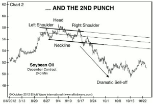
Click to Enlarge
Once the neckline gave way on Sept. 17, a dramatic selloff occurred with soybean oil falling almost 10% in the subsequent two weeks.
2. Kinross Gold Corp. (KGC)
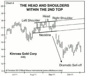
Click to Enlarge
The break of the neckline took place on Sept. 22 and initiated a months-long decline of more than 50%.
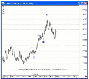
3. Cotton
In the April 1 Daily Futures Junctures, Jeffrey Kennedy presented the following price chart of cotton that showed prices nearing that ever-important neckline and wrote: “Look for a break of the neckline of the head-and-shoulders formation. If prices can manage this, selling will continue to below 80 into mid April.”
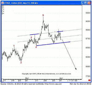
Click to Enlarge
The next chart moves forward in time to show how cotton prices did, in fact, break the neckline on their way down in a powerful selloff to near (but not below) 80 in mid April.
Click to Enlarge
The H&S is the very picture of opportunity. Learning how to recognize this chart pattern can help you be better prepared to anticipate and capitalize on the market’s moves.
By Jeffrey Kennedy of ElliottWave.com


