
Major divergences have cropped up in the market, which should serve as a warning that something large is brewing and risk is higher than normal, writes Chris Vermeulen of TheGoldAndOilGuy.com.
Last week on October 8, the financial market experienced a broad based sell-off. Every sector was down with utilities being the only exception.
The individual leadership stocks, which are typically small- to mid-cap companies (IWM – Russell 2K) that have a strong history and outlook of earnings growth, were hit hard as well.
Whenever the broad market experiences a price correction, one of the most important factors I analyze is how well leading stocks hold up and show relative strength to the broad market.
So, where does this leave us going forward?
When stocks that have been leading the market higher and only pausing during market corrections in the S&P 500, Dow, and NASDAQ, it’s a positive sign. This tells us investors and big money continues to flow into the risk-on assets (stocks).
Conversely, when these leading stocks/sectors begin succumbing to the selling pressure of the broad market, it quickly grabs my attention and tells us it’s time to be aware that a major top may be forming.
It looks as though the broad market rally is just barely hanging on. If the leading stocks and sectors begin breaking below their 50-day moving averages, my proprietary SP500 market timing & trading system will shift to sell mode and things could get ugly for those who do not know how to trade a bear market.
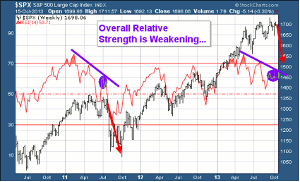
Weekly Relative Strength Showing Negative Divergence
This chart has two important things I would like to point out. First, is the fact that the RSI has been overbought twice in the past three years with the most recent one taking place a few months ago. The last time this took place, the SP500 had a very strong correction.
The second insight the RSI is providing us with is the diverging price and relative strength as shown with the purple lines on the chart below. This is telling us that the power/momentum behind the market is slowing.
Click to Enlarge
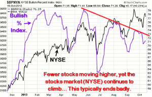
Daily Bullish Percent Index - Shows Negative Divergence
I always prefer to watch and analyze the NYSE as it’s the big board where all the HUGE money is flowing from traders and investors. The chart below clearly shows that fewer stocks are moving higher as seen with the purple bullish percent index line. With fewer stocks making new highs, yet the stock market continuing to climb, this is a warning sign that this bull market is slowly running out of steam.
Click to Enlarge
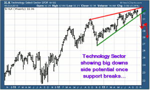
Technology & Financial Sector Are Rising, But For How Long?
Two very powerful sectors are holding up well but once they start to break down from these chart patterns, things could get ugly real quick.
The XLK technology sector looks to be forming a bearish rising wedge. If/once it starts to slide, it will have a strong impact on the broad market.
Click to Enlarge
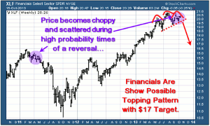
Financial Sector XLF
The recent price action of scattered trading ranges looks to be similar to the top we saw in 2011. If this is the case, then we have bearish head & shoulders pattern with a rising neckline forming. Once price breaks through the neckline, we should expect sharp drop in price.
This sector is heavily weighted in the SP500, so if it starts to drop, expect the SP500 to fall with it.
Click to Enlarge
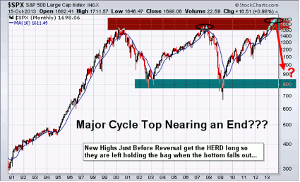
Major Market Top Lurking…
The chart below pointing out the next bear market likely to take place is a scary looking chart to most individuals. But if you know what you are doing, they can provide more profits in a shorter period of time than a four-year bull market.
This market is starting to stall out and is in the process of forming a top. Keep in mind that market tops are a process. They take typically three-six months to form before a true breakdown occurs and the bear market starts. And until then, price will be choppy and difficult to trade.
Click to Enlarge
Cautious Trading Conclusion
In short, this report shows you some major divergences in the financial market. Remember, you do not really trade off divergences, as they are not good at timing. They are simply a warning sign telling us that something large is brewing and that risk is higher than normal.
There are few ETFs I like on various sectors and commodities that show some oversized upside potential in the coming weeks/months. Depending on what takes place in Washington this week will move the market and likely trigger some sharp moves. Until then, sitting tight is the safe play.
By Chris Vermeulen of TheGoldAndOilGuy.com


