
Sponsored Content - Let’s play a little game, says Mike Turner, president, Turner Capital Investments. I am going to show you four charts, and you have to guess which chart is being shown.
These charts are all well-known indices, sectors, and ETFs. Ready?
Here is the first one.
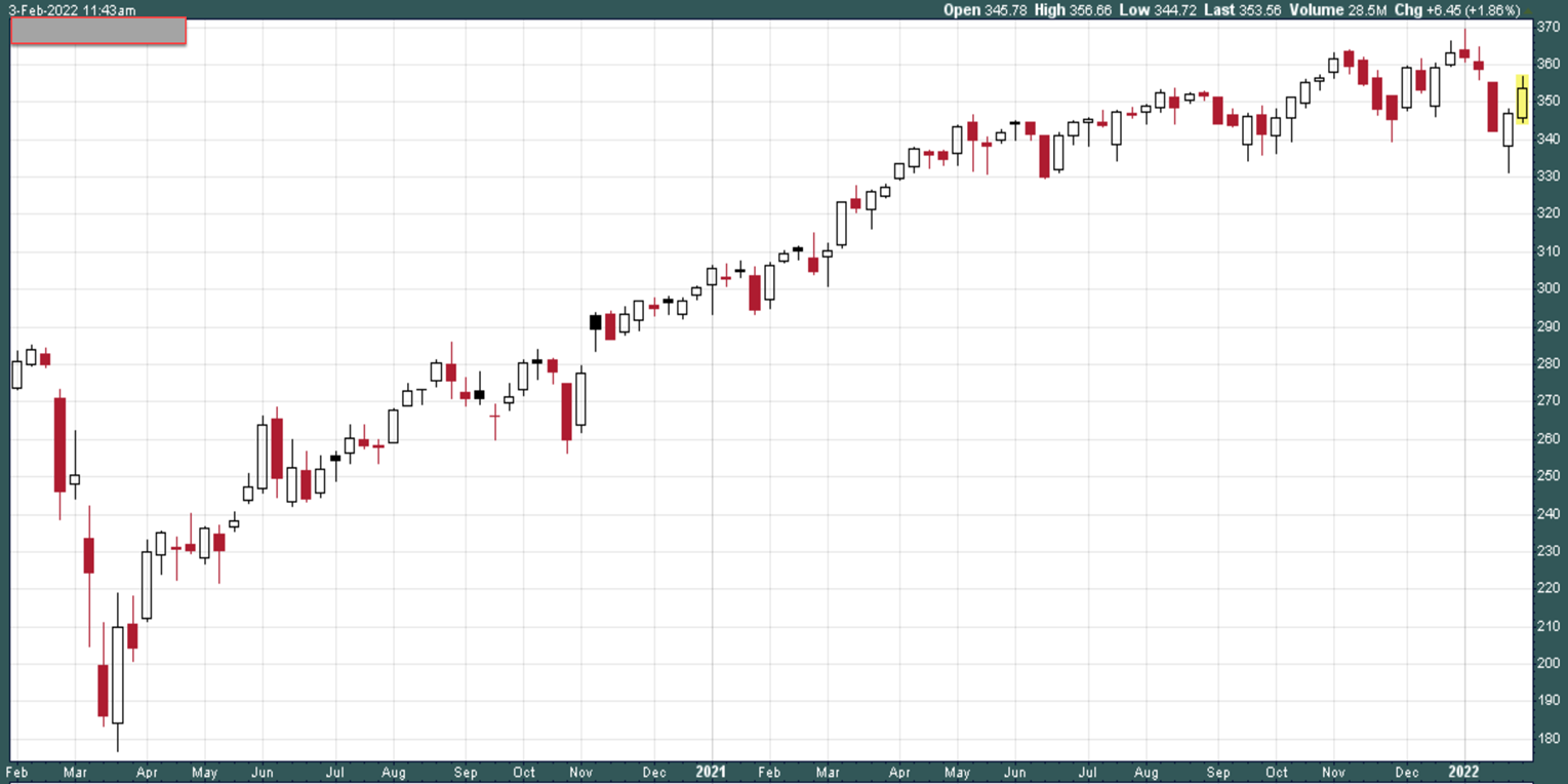
You can see the dive it took in March 2020 and the subsequent move higher after that. This chart shows a strong move higher from April 2020 through November 2021 and it has been trading in a fairly narrow range since that time. (All of the charts shown in this article are from our friends at StockCharts.com)
Give yourself a pat on the back if you recognized this as the recent chart for DIA, the ETF that represents the Dow Jones Industrial Average. It has lost some ground since making an all-time high, but it is not down much and is actually stepping higher over the past couple of weeks.
Do you consider the DJIA to be “the market”? Are you beating this market?
This next chart should be pretty easy to figure out…
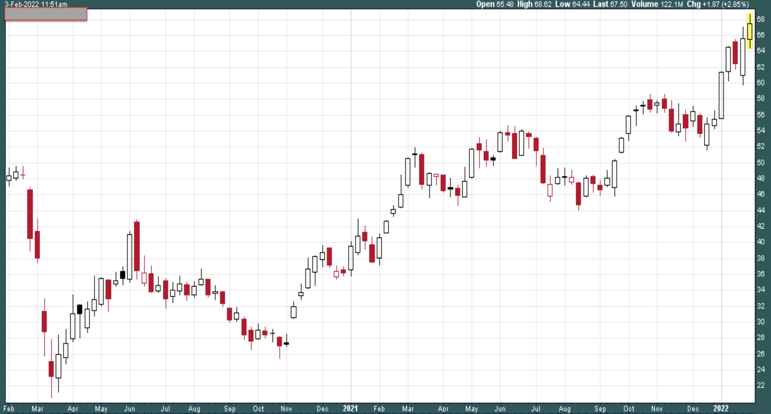
After plunging in the 2020 bear market, it recovered somewhat before falling off again in the summer and fall of 2020. It finally regained its footing and has been working its way higher for the past 15 months. It is now trading at multi-year highs (but not at the all-time high, that occurred in 2014).
This might be the easiest chart to guess. We know that the strongest part of the market is oil and this is the chart for XLE, the ETF for the S&P energy sector. With oil trading in the upper $80s, energy stocks are following and making multi-year highs. I have put a portion of client capital to work in oil and energy stocks/ETFs.
While the above chart is not “the market,” it does represent a healthy portion of the market. Are you beating this market?
Our third chart below showed solid growth from the March 2020 lows into the last part of 2021, but has sold off since making an all-time high in November of 2021.
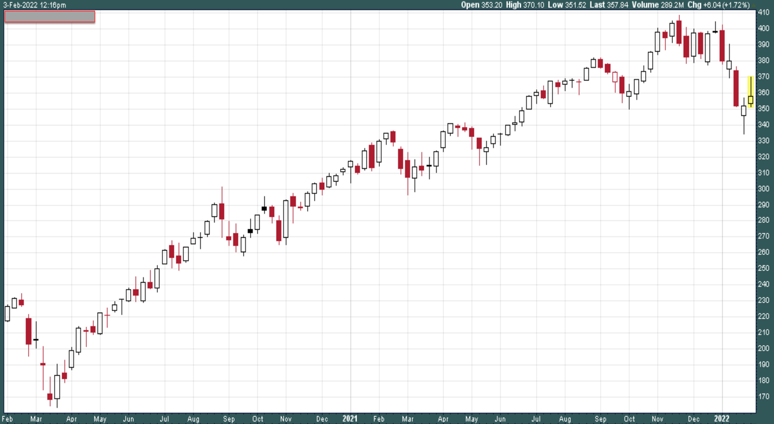
In spite of the sell-off, it has moved a little higher the past two weeks.
This is another one that should be easy to guess. It is the chart for QQQ, the ETF for the Nasdaq 100 Index. This index is heavily weighted in large technology stocks such as AAPL, MSFT, AMZN, FB, GOOGL (and GOOG), TSLA, and NVDA. QQQ is in an official “correction”—that means it is down more than 10% (it is currently down -12.5% from its high), but it is not in an official bear market yet.
Do you consider the Nasdaq to be “the market”?
Speaking of bear markets, take a look at our fourth chart, below.
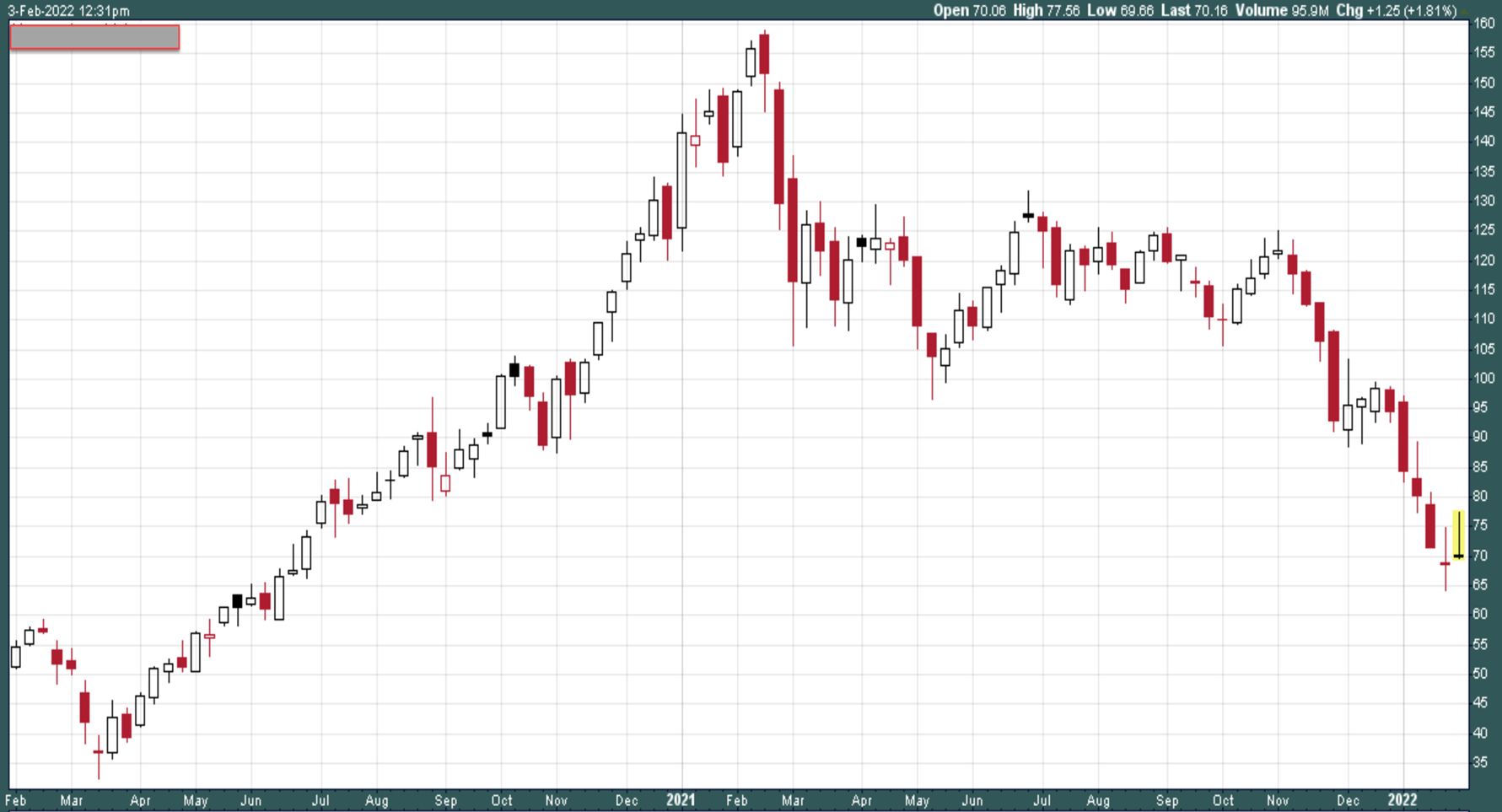
This chart above is one ugly chart. After skyrocketing at the end of the 2020 bear market, it made its all-time high a year ago and has been falling ever since.
You might have guessed that this is the chart for the Innovation ETF from ARK Investment Funds (ARKK). This ETF is down an astounding 56% in the past year and is definitely in a bear market. The ETF represents hyper-growth stocks that include names such as TDOC, ZM, COIN, and SPOT. These were darling names in 2020, but, similar to names such as AOL, Yahoo, Gateway Computers, and Netscape in the dot com crash, these stocks have lost their luster and inflicted huge losses on buy-and-hold owners.
Is this ETF “the hyper-growth” market? Are you beating this market? You probably are.
Let’s tie this all together. The headline for this blog post is “Are You Beating the Market?”
The answer depends on how you define the market you follow. If your focus is the S&P 500 only, then the market is down just 6% from its high. If your focus is the Nasdaq, the loss is twice that amount. If you have been investing in high-growth stocks, the losses are substantial; 50% or more in many cases.
This is why investing in “the market” requires more than just looking at one index or one group of stocks. The major indexes (“markets”) are certainly not overly correlated right now. The various indexes are behaving in drastically different ways. I track all of these markets on a real-time basis to determine what is best for my clients. This analysis includes what is the best investment strategy to follow right now, and even more importantly, what is best strategy to not follow. In this current, bifurcated market, protecting client capital is the number one priority. That is why we have a heavy allocation to cash. The allocation to stocks is small and highly focused. We could be on the precipice of a generational bear market, but…maybe not. Watching the trends of major indexes gives me a great insight into the direction and speed of the market, regardless of direction.
When the market is in a strong bull trend, risk of loss tends to diminish and being fully invested in strong, up-trending stocks/ETFs makes a lot of sense. This is not one of those times.
When the market is in a strong bear trend, risk of loss tends to diminish and being invested in strong, up-trending inverse ETFs can make a lot of sense. This is not one of those times, either.
When the bull trend is not well-defined and the bear trend is not well defined, I find the better course of action is to err on the side of caution and hold more cash. This is one of those times.
I send out a letter each Monday morning to my clients. In the letter, I share my thoughts on the markets, what the algorithms are telling us, and what my investment plan is for the coming week. If you’d like to sign up for this weekly update, click here. By the way, nobody will be calling you or trying to sell you anything.


