We look at how the S&P could behave in the second half of 2019, based on similar years according to Rocky White’s analysis.
A couple of weeks ago, I wrote about years that had a large percentage of positive days and a similar year-to-date return as 2019. The results were interesting, but numbers don't always capture the path taken to get to those numbers. For example, a year where the S&P 500 Index (SPX) steadily rose to a 20% gain by mid-July might not have much in common with a year that saw the index shoot higher through the first four months of the year, only to suffer its second-worst May since the 1960s, then enjoy its best June since 1955. That is what has happened this year.
This week, I'll be comparing this year's S&P 500 trajectory to past years to see if the large swings we've seen over the past couple of months tend to continue.
CHART PATTERN COMPARISON
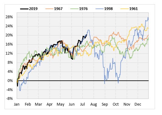
To get the chart patterns of prior years that look most like 2019, I use a least squares method. The chart below shows the 2019 year-to-date return so far, along with the four years that best match it, based on my method.
The most similar year overall so far was 1967. Like this year, the SPX surged higher from the start of 1967, topped out at the beginning of May, and had a sharp pullback in June. The current bounce off the May pullback is sharper this year than in 1967, so the pattern has detached a bit from that year.
Eyeballing the chart, the recent price action looks a lot like 1998, with the S&P 500 shooting up to around 20% year-to-date in July. Hopefully we don't suffer the same fate as that rally, where stocks topped out around 22% on the year, before falling all the way back down to year-to-date breakeven. The full-year 1998 was still a monster, with the SPX gaining 27%, but that's a harsh pullback to suffer on the way (see chart).
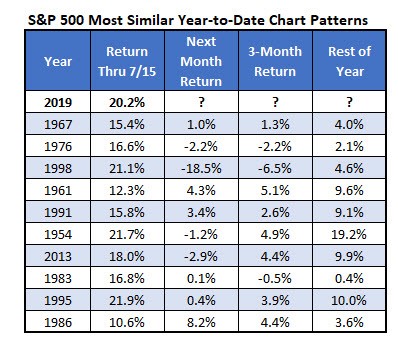
10 YEARS MOST SIMILAR TO 2019 (SO FAR)
Below are the 10 years that had a chart most resembling 2019's, as of July 15. The most recent year on the list is 2013, which saw the SPX struggle over the subsequent month, but advance nearly 10% for the rest of the year. It's notable that the rest-of-year returns are positive in every single instance, even in 1998, when the index fell nearly 20% over the subsequent month, as mentioned above.
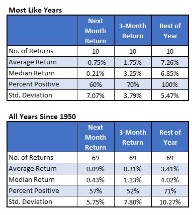
WHAT TO EXPECT FOR THE REST OF 2019
Finally, in the table below, I summarize the returns from the 10 most similar years. The second table below shows typical S&P 500 returns from this point of the year, since 1950. Using this as a guide, the market could be vulnerable to a sharp short-term pullback.
Those similar years have a negative SPX return over the next month, with a higher standard deviation of returns. The longer-term returns, however, are much better. In those similar years, the SPX averaged a rest-of-year gain of 7.26% which is more than double the typical rest-of-year returns. The standard deviation of the rest-of-year returns is a lot lower than usual, too, pointing to lower-than-usual volatility.