
In their search for patterns and indicators that will accurately predict market direction, tops, and bottoms, traders frequently refer to divergence, explains Jake Berstein of JakeBernstein.com.
As in the case of many popular indicators, divergence is not well understood by most traders. This leads them not only to misinterpret market direction, but also to take unnecessary losses. I believe that it’s imperative for traders to understand divergence as a leading indicator and as a timing trigger for predicting market moves.
In order to understand and quantify or operationalize divergence as an objective procedure we must first understand exactly what the term means. I say this because without objective parameters it’s possible that traders may not be communicating clearly when they discuss what they consider to be divergence. Consequently, in my work, I opt for a very narrow definition of divergence, one that is rule-based so as to avoid any miscommunication.
For the purposes of this discussion and the three additional articles that follow we will describe momentum as follows: “two or more markets and or indicators moving in opposite directions at approximately the same time”. Note that this is a preliminary working definition.
The good news about this definition is that we have defined a condition or pattern. The bad news about this definition is that it is open to considerable interpretation. In part two of this series I will give you a step-by-step procedure for determining divergence with 100% objectivity. First, however, I would like to show you several charts that illustrate divergence.
Divergence is an abnormal situation.
A vast majority of the time, price and indicator relationships are normal and are not divergent. The reason we look for divergence situations is simply this: divergence tends to precede changes in market direction. Divergence is, therefore, a leading indicator and depending upon how it is used, it is one of the best leading indicators available to traders. Let’s examine some charts
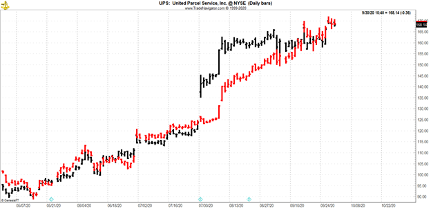
The chart below shows normal or nondivergent trends in two stocks that are fundamentally related to one another. Although UPS (UPS) and FedEx (FDX) are in exactly the same business they do not always move in the same direction at the same time. Those periods of time, which are characterized by movement in opposite directions are few. UPS is shown in black and FedEx is shown in red. For all intents and purposes the correlation is near 100% and there is no significant divergence. Now compare this chart to the one below it.
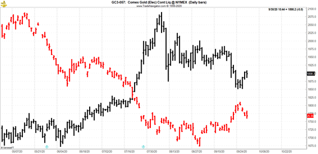
The chart below shows gold futures (in black) versus US dollar index futures (in red). Using the general definition provided earlier you can see several clear periods of divergence wherein one of the markets is moving up and the other is moving down and vice versa. While visual inspection will suffice for now, purely objective rule-based discernment of the pattern is necessary in order to make trading decisions. In the next part of this series we will examine a more objective methodology.
To learn more about Jake Bernstein, please visit JakeBernstein.com.


