

Stocks are very expensive. This isn’t news to anyone, but we still need to mention it to avoid complacency. It’s weird to discuss the fact that stocks shouldn’t go up every day, yet when it happens, we need to acknowledge it, asserts Don Kaufman, co-founder of TheoTrade.
Get Trading Insights, MoneyShow’s free trading newsletter »
The chart below is emblematic of the scenario we find ourselves in. Valuations continue to screech higher without pause. The chances of the market having a 3% pullback seem remote, so people buy in earlier and earlier. At some point, this will lead to a stock market that only goes higher. Afterwards, stocks will become so expensive that they will need to have a sharp reversal before buyers come in. That’s one thesis which explains how this period of no volatility will end.
The other explanation is that even if stocks never go down, as long as they don’t rise much faster than earnings growth, they don’t need to fall. That implies we are in a new normal where stocks rise in a straight line unless there’s a recession which causes them to fall.
Advertisement
If stocks always rise even when there are small negative events like a geopolitical issue or short-term weakness in the economy, then why sell into a recession? The economy will always recover from a recession, so why ever sell at all? That’s the slippery slope that bullish investors are prone to go down when they defend the idea that this is a new normal.
Most investors with over 10 years of experience agree with me that the 30-day realized CBOE Volatility Index (VIX) being at 5.21 isn’t sustainable. I’m not saying there’s a catalyst that will push it higher in the next few weeks; I’m saying the market will return to previous normal levels of volatility in the long term.
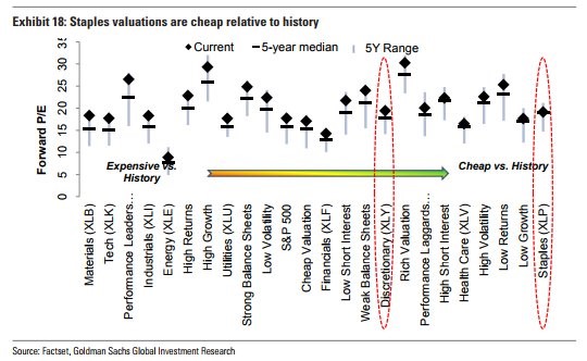
The chart of valuations below seems almost like a fake chart because of how ridiculous the stats are. It shows the consumer staples are the cheapest sector relative to history, but the valuation is still above the 5-year median and is near its 5-year high. If staples are the cheapest sector, then no sector is cheap. Every sector in the chart is above its 5-year median and near or at its 5-year high. This isn’t the most rigorous analysis because 5 years isn’t that long of a period, but it just shows how there’s not much value to be had as the Shiller PE reaches a 31 handle.
Will PCE follow PMI?
The services PMI report on Wednesday was outstanding, but it begs the question as to what it means for the economy because growth doesn’t seem to be accelerating as quickly as it suggests.
There aren’t revisions to these surveys, so either that was a one-off mistake or the economy is about to show improvements. The chart below compares the PMI to services spending. As you can see, there is a large divergence in the numbers. The nominal PCE of services hasn’t been reported for September, so we need to wait to see confirmation in the results.
It’s possible that the hurricane caused the results in the ISM survey to improve without factoring the week after the storm where few purchases were made. If that’s the case, no new uptrend is coming, but the consumer is still in solid shape.
The results for September and October give us a preview of what the holiday shopping season will look like, so they are usually important.
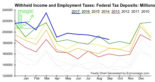
Tax withholdings negatively affected by the hurricanes
The other way to measure how the consumer is doing is to review the tax withholdings data. As you can see from the chart, the withholdings were down on a year over year basis in February and August, but up in the other months.
September had 4.4% growth in tax withholdings compared to last year. This is one of the slowest growth rates of the year. It implies weekly earnings were up between 2% and 3% and the number of workers barely grew.
This chart has raw data, so there’s always seasonality that effects the results. This time it might have been the hurricanes that caused weakness in the labor market. We have already seen a spike in jobless claims and the ADP report showing only 135,000 jobs created. The next indicator we’ll get on the labor market is the non-farm payrolls report on Friday.
Jobless claims give show improvement after storms
As I said, the jobless claims reports have been showing the impact of the hurricanes on the labor market. Let’s look at the latest results from last week. The headline report showed 260,000 claims which was 5,000 below expectations. That was a 12,000 drop from last month showing how we’re approaching normalcy in the labor market.
The Florida unemployment claims fell 3,765 and the Georgia unemployment claims fell 2,180. That shows how the effects of Irma are rescinding. The Texas claims fell 3,040 which shows the negative effects from Harvey are mostly gone. I’m surprised to see that Puerto Rico’s claims fell slightly. It might be because the island is so devastated that no one can even file for unemployment insurance.
The latest consensus estimate for the BLS report on Friday is for 90,000 jobs created. That’s near what I’m expecting. Usually, the breakdown of the specifics matters more than the headline number. Stats like total hours worked, weekly wage growth, and which sectors are doing well will tell us more details about the labor market. We might be able to look at some of the stats to determine if the new orders numbers from Markit were right or if the ones from the ISM were more accurate.
Conclusion
Stocks are very expensive. This isn’t news to anyone, but we still need to mention it to avoid complacency. It’s weird to discuss the fact that stocks shouldn’t go up every day, but when it happens, we need to acknowledge it.
The BLS headline will be weak, but there might be some information in the report to help us determine the health of the economy. My philosophy on economics is to look at everything and weigh the economic metrics according to their importance. I still focus on the health of the economy even though the market has been on autopilot this year.


