

The major averages continue to climb higher, states Bonnie Gortler of bonniegortler.com.
Four sectors were stronger than SPDR S&P 500 ETF Trust (SPY), which gained +2.02% the week ending 11/05/21. Consumer Discretionary (XLY) and Technology (XLK) were the strongest sectors, while Financials (XLF) and Health Care (XLV) were the weakest.
S&P SPDR Sector ETFs Performance Summary
Week Ending 10-29 - 11/05/21
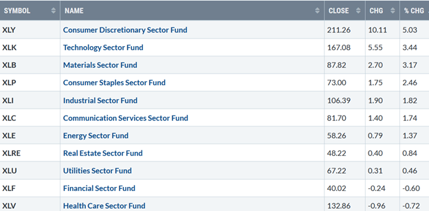
Source: Stockcharts.com
The Dow rose +1.42%, up four weeks in a row, its longest win streak since 2019. The S&P 500 is up +2.0%, seven days in a row. The Nasdaq gained +3.05%, up ten days in a row. The star of the week was the Russell 2000 Index, gaining +6.09%.
The Value Line Arithmetic Average, a mix of approximately 1700 stocks, rose +3.79%, penetrating the upper channel. The transportation average surged +5.89%, the fourth straight week of gains outperforming both the S&P 500 and Nasdaq.
Weekly market breadth was solid for both the NYSE and Nasdaq. The New York Stock Exchange Index (NYSE) had 2490 advances and 1021 declines. Nasdaq had 3495 advances and 1458 declines. Weekly new highs were impressive, 549 for the NYSE, and 780 for Nasdaq.
Figure 1: 10-Year US Treasury Yields
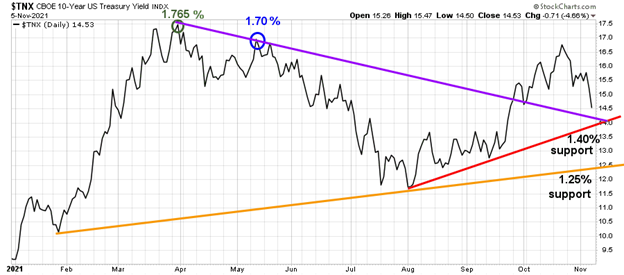
Source: Stockcharts.com
10 -Year US Treasury yields fell after hitting a high of 1.691%, closing at 1.453% support, fueling growth stocks higher (Figure 1). Support is between 1.25% and 1.40%.
Figure 2: 5 Year US Treasury Yields
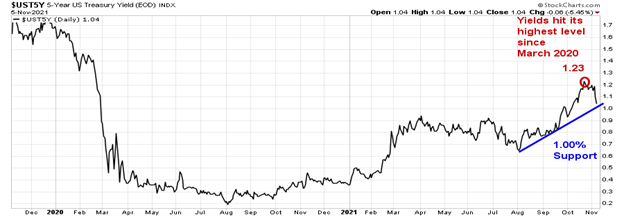
5 -Year US Treasury yields fell to 1.04%, after hitting their highest level since March 2020 of 1.230%. Support is at 1.00%.
Figure 3: ETFs Performance 10/29/21 – 11/05/21
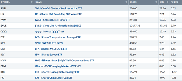
Source: Stockcharts.com
Semiconductors, small cap value, and small cap growth led last week, while emerging markets, biotechnology, and China lagged the US market.
Figure 4: CNN Fear and Greed Index
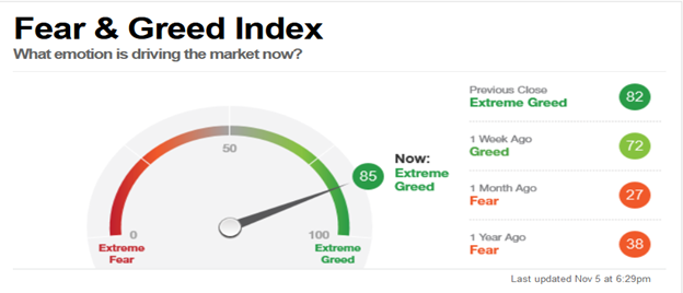
The S&P 500 (SPX) index has been up 16 of the past 18 days. Based on CNN Fear and Greed Index (a contrary indicator), market sentiment rose 10 points for the week, from 72 to 82, rising from 27 one month ago to extreme greed. Now is not the time to be complacent. Buyer beware.
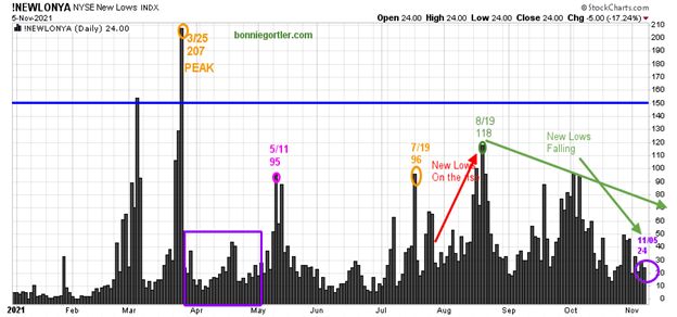
Figure 5: Daily New York Stock Exchange (NYSE) New Lows
Source: Stockcharts.com
On 3/25/21, the NYSE new lows peaked at 207 (orange circle) and then contracted (purple rectangle), followed by a jump to 95 on 5/11. New lows then declined from 5/11 to 7/19. New lows rose to 96 (orange circle) in August, peaking at 118 (green circle) on 8/19.
Watching new lows on the New York Stock Exchange is a simple technical tool that helps awareness about the immediate trend's direction.
Learn more in my book, Journey to Wealth. The market is very strong when the new lows are below 25 (very low risk and prices tend to rise). When new lows are between 25 and 50, the risk is still low, and prices tend to rise.
New lows contracted last week, closing at 24 (purple circle), now in the lowest-risk zone where prices tend to rise. A significant correction is not likely until new lows rise and close above 150 (blue line).
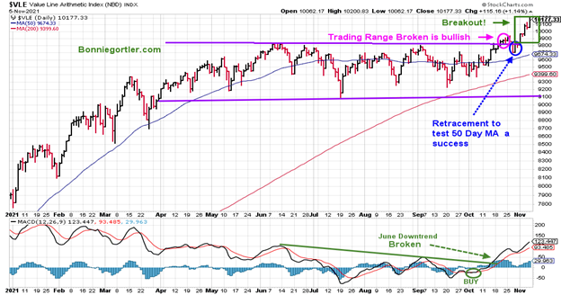
Figure 6: The Value Line Arithmetic Average Week of 11/25
Source: Stockcharts.com
The Value Line Arithmetic Average is a broad index, a mix of approximately 1700 stocks. The Value Line Arithmetic Average had two closes above the trading range, confirming the breakout (pink circle), then there was no follow through to the upside. It turned down for three days, retracing to test the 50-day moving average, and last week reversed sharply higher, confirming the breakout.
MACD (lower chart) broke the June downtrend, then turned up, and last week closed at its highest level since June, confirming the breakout.
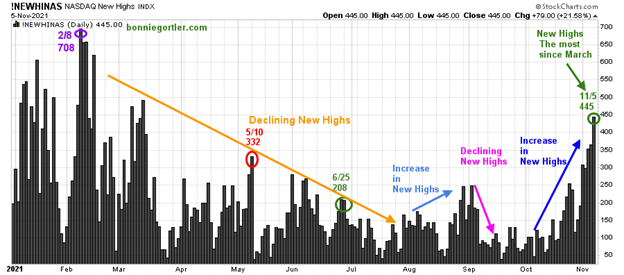
Figure 7: Nasdaq New Highs
Source: Stockcharts.com
Nasdaq new highs hit a peak reading of 708 on 2/8 (purple circle), and then trended lower from February through July. New highs have increased since October. On 11/5, the Nasdaq had the highest number of new highs since May 10, closing at 445. It will be favorable if new highs expand over the next few weeks.
On the other hand, if new highs contract sharply, with more new lows than new highs, the rally may quickly come to an end.
Figure 8: Daily Nasdaq Advance-Decline Line
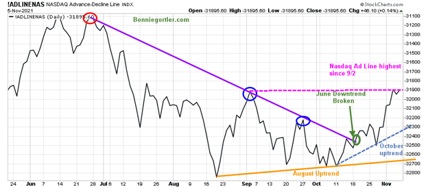
Source: Stockcharts.com
The daily Nasdaq advance-decline line failed to get through the June downtrend (purple line) and turned down in September, making lower highs. The Nasdaq AD line made a higher low in October, holding above the August lows (orange arrow), and turned up. The first week of November, the AD line has risen sharply and closed at its highest level since 9/2. Further strength would be favorable.
Figure 9: Weekly Nasdaq Advance-Decline Line
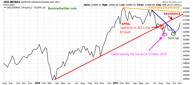
The weekly advance-decline (AD) line trend broke the June downtrend, making a higher low after closing at the lowest weekly AD line reading since October 2020.
Market breadth has improved since the low was made, and turned up breaking the February downtrend, a positive sign. Continued expanding weekly breadth (more issues up than down) is favorable.
It remains to be seen if there is enough strength to penetrate resistance. If breadth weakens and takes out the August low, expect a correction.
Figure 10: Transportation Average
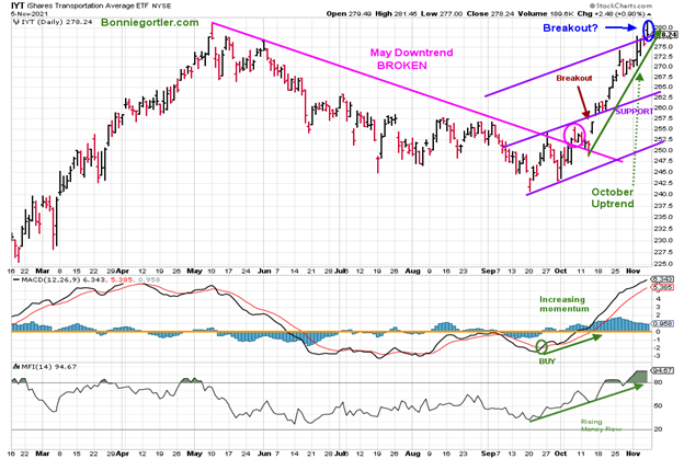
Source: Stockcharts.com
The Transports (IYT) closed at 278.24, up 2.76%, reaching its upside target of 275.00. The next upside objective is 287.50, followed by 300.00. Support is 272.50, followed by 262.50, followed by 250.00. MACD (middle chart) and Money Flow (bottom chart) continue to rise, confirming the strength in IYT. Watch for when money flow turns down for a clue IYT will begin to weaken.
Figure 11: Daily iShares Russell 2000 (IWM) Price (Top) and 12-26-9 MACD (Middle and Money Flow (Bottom)
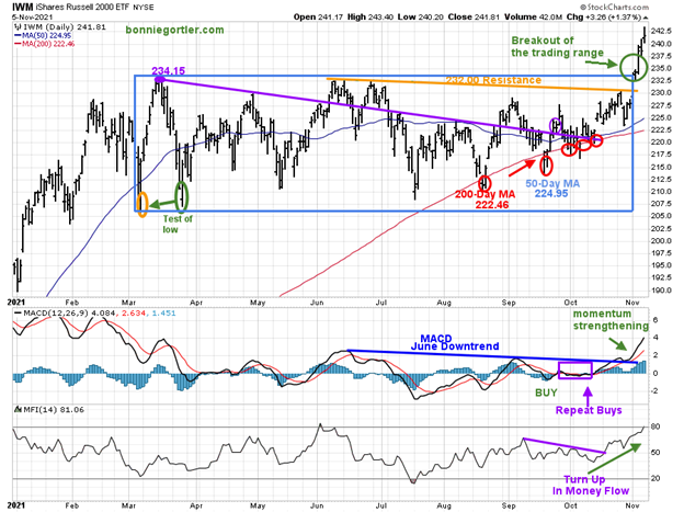
Source: Stockcharts.com
The top portion of the chart is the daily iShares Russell 2000 Index ETF (IWM), the benchmark for small-cap stocks, with a 50-day moving average (MA) (blue line) and 200-day moving average (MA), that traders watch and use to define trends.
IWM made a low on 3/5, then peaked at 234.15 (purple circle), followed by declines to test the March lows and the March high. There were five penetrations of the 200-day MA (red circles) within the trading range (blue rectangle). However, none triggered major selling.
MACD (middle chart) broke the early June downtrend (green line). MACD gave repeat buys in August, September, and October, as IWM stayed in the trading range. Money flow improved in October.
A week to remember for small caps. The bulls took control last week. MACD and Money Flow (lower chart) made new highs as IWM penetrated 232.00 resistance and then broke out of its trading range, closing at 241.81 up +6.03%.
The new upside objective is 259.00. Support is at 234.00 followed by 230.00 and 225.00. IWM is gaining strength compared to the S&P 500 (SPY).
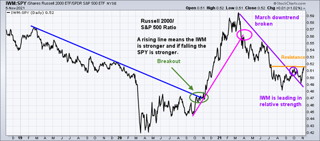
Figure 12: Daily Relative Strength Ratio Russell 2000/S&P 500
Source: Stockcharts.com
A rising line means the IWM is stronger, and if falling, the SPY is stronger. IWM has turned up and is now leading in relative strength.
If IWM outperforms the S&P 500 (SPY) and gets through resistance this week, the odds favor IWM will outperform the S&P 500 in the near term. IWM/SPY ratio on the weekly chart has already penetrated their October high (chart not shown). In turn, I expect further strength in IWM compared to SPY in the coming weeks to months.
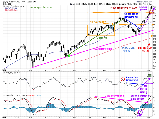
Figure 13: Daily Invesco QQQ Trust Nasdaq (QQQ) Price (Top) Money Flow (Middle) and 12-26-9 MACD (Bottom)
Source: Stockcharts.com
The chart shows the daily Invesco QQQ, (QQQ) an exchange-traded fund based on the Nasdaq 100 Index with its 50-day moving average and 200-day moving average. In June, QQQ was in a trading range (orange rectangle), and then broke out above 370.00 in August, which failed. A decline followed to 350.00 support in late September.
The March uptrend (top chart) remains intact (pink line).
After breaking the short-term downtrend from 10/7 (blue line), QQQ continued to climb. QQQ was up big, gaining +3.23%, closing at 398.60 above the upside objective of 390.00. The new target is 410.00.
Money Flow (middle chart) peaked in mid-September (red circle) and then trended down. Investors rotated back into growth stocks, and money flow rose (purple arrow), breaking the September downtrend (blue line).
The lower chart is MACD (12, 26, 9), a measure of momentum. MACD gave a timely buy signal. Its bullish MACD is rising with a strong thrust of momentum after breaking the July downtrend.
Short-term support is at 390.00, followed by 380.00, and 370.00. A close below 370.00 would imply a pullback to 360.00, followed by 350.00.
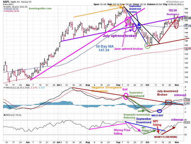
Figure 14: Apple (AAPL) Daily
Source: Stockcharts.com
Apple (AAPL) peaked on 9/7/21 at 157.26 (orange circle). AAPL then declined to fall below its June uptrend (pink circle), and below its 50-day moving average in September (purple circle), before bottoming in October (green circle).
AAPL had a quiet week, up 1.14%, and remains above its 50-day MA. After two weeks of low volatility, no big gain or loss like other stocks I watch, and a potential short-term cycle bottom, I am looking for a big move in AAPL this week. A close above resistance at 152.00 will excite the bulls towards 157.00 and above.
MACD (middle chart) remains on a buy (blue circle). Momentum has waned after breaking the July downtrend. Money Flow (lower chart) was rising (brown arrow) and also moving sideways. A turn up in either indicator would be positive. On the other hand, a turndown would be negative.
Support is at 147.00, followed by 143.00, and 140.00.
A close below 140.00 and a MACD sell would imply weakness to 130.00, followed by 122.00.
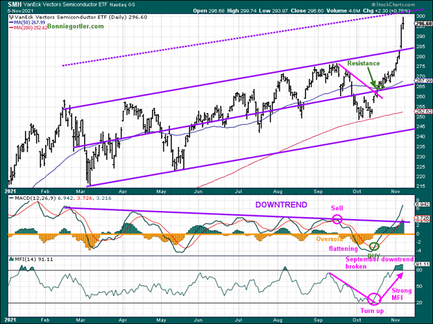
Figure 15: Van Eck Semiconductors (SMH) Daily
Source: Stockcharts.com
Semiconductors explode to the upside after meeting all our expectations in the last two weeks. SMH is a leading indicator of the technology sector.
Last week, SMH led the technology sector and the broad market higher, up 8.39%. MACD (middle chart) remains on a timely buy. Momentum accelerated to the upside, after breaking the February downtrend. Money flow (lower chart) remains strong.
This week it would be bullish if SMH continues to lead, making a new high confirmed by MACD, breaking the February downtrend (purple line).
Upside objective is 303, followed by 322.00. Support is 296.00, followed by 285.00.
Figure 16: ARKK Innovation
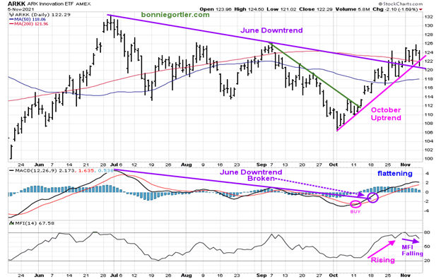
Source: Stockcharts.com
ARK Innovation ETF (ARKK), an actively managed ETF by Cathie Wood that seeks long-term growth.
ARKK broke its September short-term downtrend (green line) and rallied. ARKK closed above the October uptrend (pink line).
Support is at 118.00, followed by 114.00.
MACD is on a buy and is now flattening. Money flow (lower chart) is rising, suggesting a breakout to the upside is still possible. Unless money flow turns down and ARKK closes below 114.00, give the bulls the benefit of the doubt.
Summing Up:
The Dow, S&P 500, and Nasdaq closed at record highs and in a solid uptrend. All three indexes rose for the fourth week in a row. Market breadth is improving, and the rally is broadening. There are no signs of investors rotating out of Technology at this time. Stocks are extended, but with Semiconductors and the Russell 2000 leading the way, the odds favor the bulls. A slowdown or consolidation may be needed in the short term to alleviate some of the optimism before more gains. Be alert; euphoria is in the air. Market sentiment has shifted in one month from pessimism to optimism. For now, enjoy the rally, but prepare your plan to protect your gains.
Remember to manage your risk, and your wealth will grow.
I would love to hear from you. If you have any questions or comments or would like to talk about the market, email me at Bonnie@Bonniegortler.com.
Disclaimer: Although the information is made with a sincere effort for accuracy, it is not guaranteed that the information provided is a statement of fact. Nor can we guarantee the results of following any of the recommendations made herein. Readers are encouraged to meet with their own advisors to consider the suitability of investments for their own particular situations and for determination of their own risk levels. Past performance does not guarantee any future results.


