

The long-term chart of the 30-year treasury yield may now be the most important chart in the world, states Jesse Felder of TheFelderReport.com.
For the past 30 years or so, the 30-Year Tresury Yield (TYX) on the long bond has formed a fairly neat channel that has only been violated relatively briefly at times. The drop below 1%, at the height of the Covid panic, tested the lower end of that channel. Since then, it has reversed higher and now appears poised to test the upper end. This area also coincides with key horizontal resistance at 2.5% that dates back to the lows put in at the height of the Great Financial Crisis.
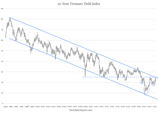
In reversing from its low two years ago, the 30-year yield has also formed a pretty clear inverted head and shoulders pattern, so it appears we are at a crucial spot for the multi-decade bond bull market. A reversal lower here for the long bond yield would suggest that the bull market remains intact; a breakout higher, however, would suggest it has finally come to an end. It would also indicate that, after a very long hiatus, the bond vigilantes may have returned and are determined to pressure a Federal Reserve that has fallen further behind the curve than ever before.
Learn more about Jesse Felder at TheFelderReport.com.


