

The rally continued, with all S&P SPDR sectors moving higher last week, notes Bonnie Gortler of bonniegortler.com.
Energy (XLE) and Financials (XLF) were the best sectors, while Healthcare (XLV) and Consumer Staples (XLP) lagged. The SPDR S&P 500 ETF Trust (SPY) rose by +3.30%.
S&P SPDR Sector ETFs Performance Summary 8/5/22 – 8/12/22
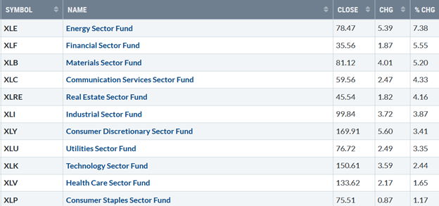
Source: Stockcharts.com
Figure 2: Bonnie's Mix of ETFs Performance Summary 8/5/22 – 8/12/22
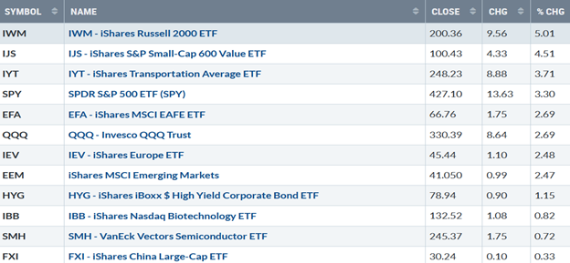
Source: Stockcharts.com
Investors continued buying as bargain hunting continued. Small Caps, both growth and value stocks, outperformed the S&P 500. International markets, including Europe and Emerging Markets, joined the advance. If this continued, it would be a positive sign for US markets to have more room for the upside.
Figure 3: Fear And Greed Index
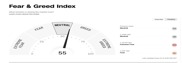
Source: Source: Cnn.com
With the recent rally, optimism is rising quickly and bears watching. Based on the CNBC Fear and Greed Index (a contrary indicator), market sentiment rose to 54, much higher than one month ago when it showed extreme fear. At this pace, it could quickly get to greed or extreme greed within a few weeks and increase the risk of a correction.
Figure 4: UST 10YR Bond Yields Daily
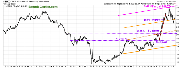
Source: Stockcharts.com
ProShares Ultra 7-10 Year Treasury 2x Shares (UST) rose slightly to close at 2.849% last week. Support is 2.70%, followed by 2.20% and 2.15%.
The major averages penetrated their June highs. The Dow (^DJI) gained +2.92%, S&P 500 (SPX) up +3.26%, and the Nasdaq (NDX), the leading performer, rose +3.08%. The Russell 2000 Index (RUT) rose +4.93%, while The Value Line Arithmetic Index (a mix of approximately 1700 stocks was higher by +4.45%.
Weekly market breadth was positive for the New York Stock Exchange Index (NYSE) and Nasdaq. The NYSE had 2695 advances and 788 declines, with 139 new highs and 114 new lows. There were 3568 advances and 1662 declines on the Nasdaq, with 284 new highs and 255 new lows.
Finally, there were more new highs than lows on the NYSE and NASDAQ.
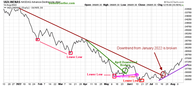
Figure 5: Nasdaq Advance-Decline Line (Daily)
Source: Stockcharts.com
There was an improvement in breadth at the end of May and early June after breaking its April downtrend (green line), but it was short-lived, followed by weakness in Nasdaq.
Since July, market breadth has steadily improved after breaking the January downtrend (brown line), leading to a powerful advance in the Nasdaq.
Nasdaq gained more than the S&P 500 on positive breadth, in an uptrend (purple line). As long as breadth is positive, Nasdaq is likely to continue higher.
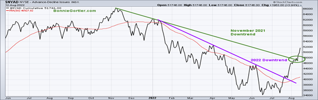
Figure 6: NYSE Cumulative Advance-Decline Line
Source: Stockcharts.com
The chart above is a breadth indicator representing the cumulative difference between the number of advancing and declining stocks on the New York Stock Exchange (NYSE).
A steady improvement in market breadth after breaking the 2022 downtrend (purple line), implying underlying market strength. This week another hurdle confirmed the power of the rally when the downtrend broke from November 2021(green line).
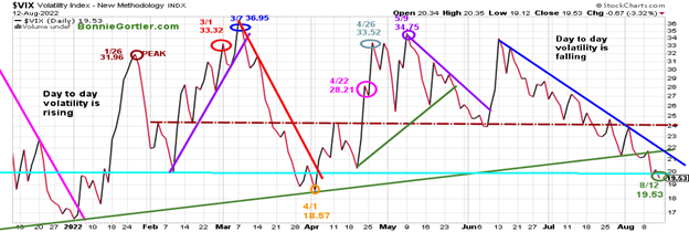
Figure 7: CBOE Volatility Index VIX
Source: Stockcharts.com
The CBOE Volatility Index (VIX), a measure of fear, has been trading above 20.00 for most of 2022. In January, VIX made a high at 31.96 on 1/26 (brown circle), on 3/1 at 33.32 (red circle), and peaked at 36.95 on 3/7 (blue circle).
VIX continued to fall last week as the major averages rose, closing at 19.53 (green circle). Now that VIX is below 20, intra-day volatility is likely to be reduced. On the other hand, a close above 24.00 (brown dotted line) would imply an increase in short-term volatility and a sign that a short-term pullback could begin.
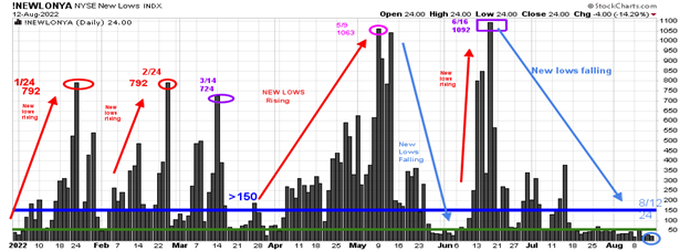
Figure 8: Daily New York Stock Exchange (NYSE) New Lows
Source: Stockcharts.com
Watching New lows on the New York Stock Exchange is a simple technical tool that helps awareness of the immediate trend's direction.
new lows warned of a potential sharp pullback, high volatility, and "panic selling" for most of 2022, closing above 150. As the market started to move lower in January 2022, new lows rose sharply, peaking at 792 on 1/24 and again on 2/24 (red circles), implying an increased risk of further selling pressure. Investors in early May unloaded stocks, and new lows expanded to 1063 on 5/9 (pink circle), then on 6/16 (purple rectangle), new lows made a new high of 1092.
Learn more about the significance of new lows in my book, Journey to Wealth, published on Amazon.
New lows contracted in June and no longer are in the high-risk zone above 150, closing at 24 on 8/12 (light blue circle), below 25, indicating a low risk of a significant decline.
On the other hand, a warning would occur if new lows increase to above 150, then I would expect weakness in the near term.
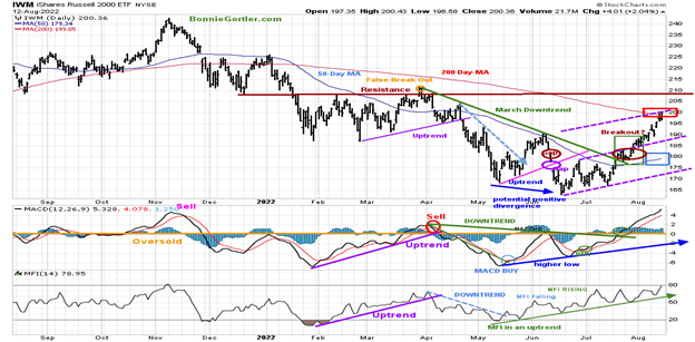
Figure 9: Daily iShares Russell 2000 (IWM) Price (Top) and 12-26-9 MACD (Middle) and Money Flow (Bottom)
Source: Stockcharts.com
The top portion of the chart is the daily iShares Russell 2000 Index ETF (IWM), the benchmark for small-cap stocks, with a 50-Day Moving Average (MA) (blue line) and 200-Day Moving Average (MA) that traders watch and use to define trends. At the end of March,
IWM failed to break out above resistance at 210.00 (orange circle) and turned down, forming a downtrend (green line). In late July, IWM broke its March downtrend.
IWM was up sharply, closing at 200.36. near their weekly highs, up +5.01%, gaining more than the S&P 500, which bodes well for the broad market. IWM remains above the 50-Day Moving Average (blue rectangle) and is now above the 200-Day Moving Average (red rectangle), likely to attract more buying.
Short-term resistance is 210.00, with support of 196.00, 193.00, and 187.00.
MACD (middle chart) remains on a buy, rising since a clear positive divergence (one of my favorite patterns) formed. It’s been a strong rally off the lows, with MACD breaking the momentum downtrend from April, rising above zero, and continuing to make higher highs, now at the highest level since November 2021. To learn more about MACD divergences, email me, and I will send you my article MACD Made Simple.
Money Flow (lower chart) broke the April downtrend (dotted blue line) and has accelerated. It is now at its highest reading since the April peak and continues its uptrend as money flows into small caps.
The IWM Intermediate Trend is Positive—MACD Buy
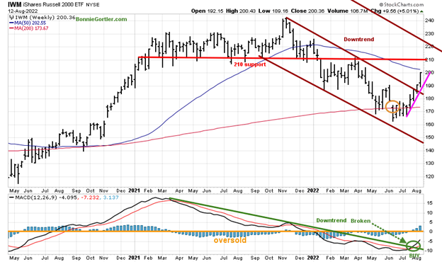
Figure 10: Weekly iShares Russell 2000 (IWM) Price (Top) and 12-26-9 MACD (Bottom)
Source: Stockcharts.com
The Russell 2000 (IWM) closed above its price downtrend from November 2021(brown line) two weeks ago, shifting the intermediate trend to up.
IWM is just shy of the 50-Week Moving Average at 202.55. Resistance is at 210.0, followed by 220.00, and support is at 185.00. Upside target 228.00.
MACD (lower chart) is on a buy (green circle) along with breaking the downtrend from March 2021 (green line). The worst of the downside momentum is likely completed.
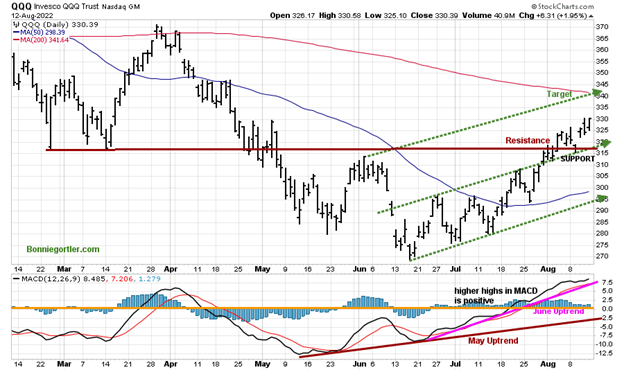
Figure 11: Daily Invesco QQQ Trust (QQQ) Price (Top) and 12-26-9 MACD (Bottom)
Source: Stockcharts.com
The chart shows the daily Invesco QQQ (QQQ), an exchange-traded fund based on the Nasdaq 100 Index. The two top holdings in QQQ are Apple (AAPL) and Microsoft, totaling 23.95%. The direction of both these stocks will impact the direction of QQQ.
QQQ rose +2.69%, closing at 330.39 last week, above resistance with an upside target of 340.00. Support is at 320.00, 315.00, and 295.00.
The bottom chart is MACD (12, 26, 9), a measure of momentum; MACD remains on a buy with a pattern of higher highs in a clear uptrend. However, MACD is overbought and in an area where a turn down may occur soon if there is weakness in QQQ. The first decline is likely not to be a major pullback.
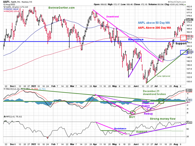
Figure 12: Apple, Inc (AAPL) Price (Top) and 12-26-9 MACD (Middle) and Money Flow (Bottom)
Source: Stockcharts.com
Apple (AAPL) continues to lead the technology higher, closing at 172.10, up +4.08% last week and above its 50 and 200-Day Moving Average. AAPL remains in an uptrend since the middle of June (green line).
Support is at 165.00, 162.00, and 155.00. Resistance is at 177.00 and 180.00.
MACD (middle chart) remains on a buy and continues to make higher highs after breaking the December 2021 downtrend.
Money Flow (lower chart) is strong and in an uptrend (green dotted line).
As long as support at 155.00 holds in APPL, the rally in technology stocks will likely continue. On the other hand, a close below 155.00 and MACD sell with a break in the uptrend of the Money Flow index would imply a short-term correction or consolidation.
With the intermediate trend changing from down to up, and improvement in market breadth, the major averages are likely to work their way higher. The best rallies are the ones that don’t give up much ground.
Figure 13: SPDR S&P MidCap 400 (MDY) Weekly Price (Top) and 12-26-9 MACD (Bottom)
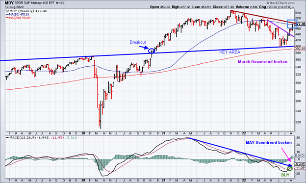
Source: Stockcharts.com
The SPDR S&P MidCap 400 (MDY) (top chart) has acted much better lately after holding critical support in June and made a pattern of higher lows.
Last week I mentioned a buying opportunity, and MDY rose 4.47% for the week. It’s bullish that MDY has closed above the March price downtrend, and MACD (lower chart) is on a buy (green circle) and did break the downtrend (blue line), which increases the odds of higher prices ahead.
Figure 14: iShares Transportation Average (IYT)
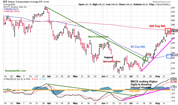
Source: Stockcharts.com
The Transportation Average (IYT) broke its price downtrend from March (green circle) in July and then consolidated near the 50-Day Moving Average before moving higher.
IYT gained 3.71% last week. Resistance is at 249.00, and support is at 235.00 and 222.00.
MACD remains on a buy, above zero, making higher highs showing internal strength. However, it would be a short-term positive if IYT shows continued strength and leads the market higher. IYT is now close to penetrating above its 200-day MA (red rectangle), which stands at 249.13 as of this writing.
Keep an Eye on the Direction of Commodity Prices
Figure 15: CRB Reuters/Jefferies CRB Index Daily and West Texas Crude Oil, Gasoline, Soybeans, Wheat, and Cotton
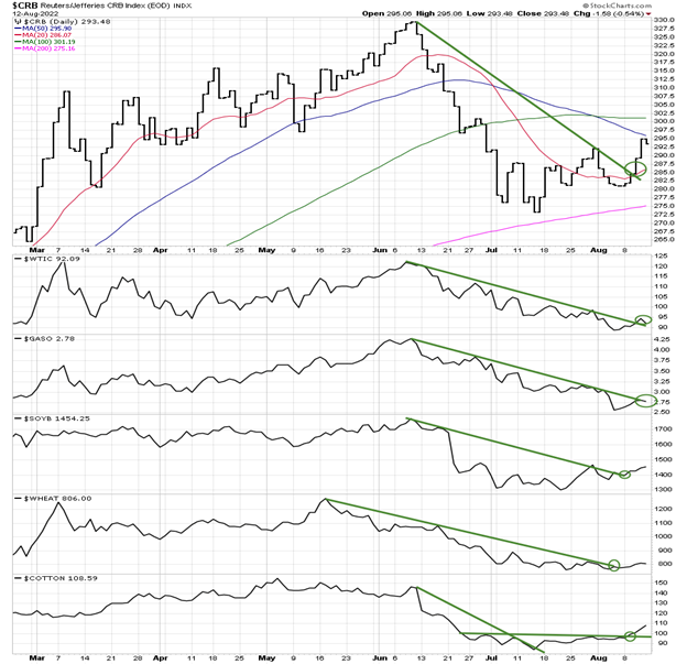
Source: Stockcharts.com
Be alert to the downtrends that have broken in commodities. Is there something going on we don't know about? Is there another leg up in commodities after peaking in May and June? Only time will tell.
Potential Buying Opportunity (High Risk)
Figure 16: Invesco Agriculture Fund (DBA)
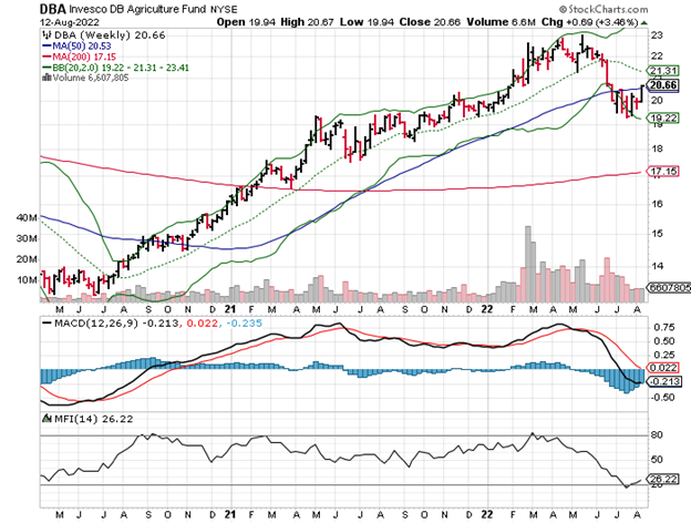
The Invesco Agricultural Fund (DBA) trend has shifted from down to up. DBA is no longer falling and has broken the May Downtrend (pink line), closing above its 50-Week MA.
MACD has flattened, but no buy as of yet, but it could occur soon if DBA shows strength.
Summing Up:
The short and intermediate trend remains up. Its bullish market breadth is improving in combination with downtrends penetrated for the short term (daily) and the intermediate-term (weeks to months), which favors an extension of the rally. However, the short-term technical indicators are positive but are now overbought and ripe for a pullback on any bad news. The market internals are bullish until they are not. Only after the fact will we know for sure if the rally will stall or the rally will power ahead. Be alert to a surge in commodity prices in the next several weeks which could derail the rally. Let the price action determine the direction where the market will go.
Remember to manage your risk, and your wealth will grow.
I would love to hear from you. If you have any questions or comments or talk about the market email me at Bonnie@Bonniegortler.com.
Disclaimer: Although the information is made with a sincere effort for accuracy, it is not guaranteed that the information provided is a statement of fact. Nor can we guarantee the results of following any of the recommendations made herein. Readers are encouraged to meet with their own advisors to consider the suitability of investments for their own particular situations and for determination of their own risk levels. Past performance does not guarantee any future results.


