

There was no place to hide with back-to-back ugly weeks as The Dow, S&P 500 (SPX), Nasdaq, and all eleven S&P SPDR sectors are down, notes Bonnie Gortler of bonniegortler.com.
Utilities (XLU) and Consumer Staples (XLP) fell the least, while Consumer Discretionary (XLY) and Energy (XLE) were the worst sectors. The SPDR S&P 500 ETF Trust (SPY) fell sharply -4.57%, selling off sharply for the second week.
S&P SPDR Sector ETFs Performance Summary
9/16/22 – 9/23/22
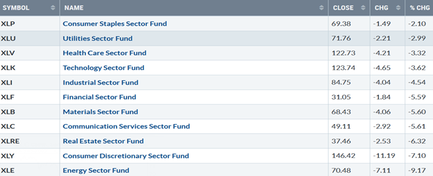
Source: Stockcharts.com
Figure 2: Bonnie's Mix of ETFs
Performance Summary 9/16/22 – 9/23/22
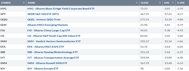
Source: Stockcharts.com
Fear amongst investors of recession concerns increased and accelerated the decline after the US and global central bank tightening. Investors dumped US stocks last week, led by Small Caps and Transportation falling. International markets were also hit, led by Europe.
Figure 3: UST Ten-Year Bond Yields Daily
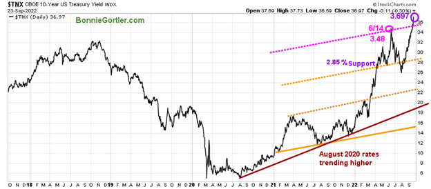
Source: Stockcharts.com
The Ten-Year US Treasury yields rose sharply, closing at 3.697% last week, above the June highs, breaking the upper channel, and is at the highest since 2010. Yields could stall in the near term at 3.80%, but even higher yields are possible. Support is at 2.85%, followed by 2.30%.
Figure 4: UST Two-Year Bond Yields Daily
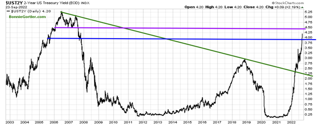
The Two-Year Treasury Yield closed at 4.20%, its highest level since 2007.
In Sum
Interest rates continue rising at a fast pace not seen in many years.
The major averages closed near their worst levels of the week. The Dow was down -4.00%, S&P 500 down -4.65%, and the Nasdaq down -5.48%. The Russell 2000 Index was also down sharply, falling -by 6.60%, while the Value Line Arithmetic Index (a mix of approximately 1700 stocks) dropped by 6.22%. Weekly market breadth was ugly on the New York Stock Exchange Index (NYSE) and Nasdaq. The NYSE had 392 advances and 3088 declines, with 63 new highs and 1241 new lows. There were 943 advances and 4359 declines on the Nasdaq, with 1149 new highs and 1597 new lows. Continued poor market breadth is negative.
Figure 5: Nasdaq Advance-Decline Line (Weekly)
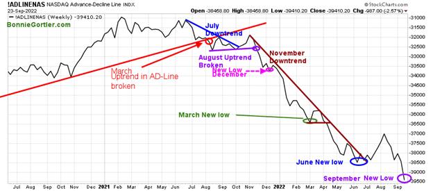
Source: Stockcharts.com
At the end of May and early June, after breaking its April downtrend (green line), there was an improvement in breadth that stalled quickly. The rally in Nasdaq stalled, then the weekly AD-Line made a lower low. In July, market breadth improved, starting an uptrend in the AD-Line with a powerful advance in the Nasdaq. However, in August, market breadth weakened again, followed by a new low last week.
Figure 6: Nasdaq Advance-Decline Line (Daily) Longer-term View
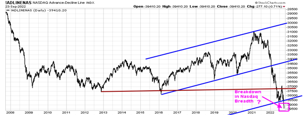
A longer-term view on a daily basis shows Nasdaq breadth with the potential of a significant breakdown (Pink Rectangle). Time will tell how serious the weakness in breadth really is.
Figure 7: CBOE Volatility Index VIX
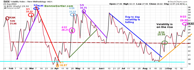
Source: Stockcharts.com
The CBOE Volatility Index (VIX), a measure of fear, has been trading above 20.00 for most of 2022. In late January, VIX made a high at 31.96 on 1/26 (brown circle), on 3/1 at 33.32 (red circle), and peaked at 36.95 on 3/7 (blue circle), making a low on 4/1 at 18.57. VIX approached the low in August but has been rising since. VIX rose to closed at 29.92 (pink circle), above 24.00 (brown dotted line), which has been acting as resistance and support. Intra-day volatility will likely remain high as long as VIX closes above 24.00. Potentially VIX could go to 60 or higher if the selling accelerates before a short-term rally occurs.
Figure 8: New York Stock Exchange (NYSE)
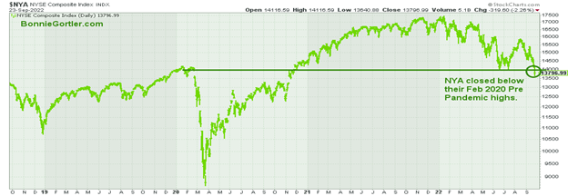
Source: Stockcharts.com
The New York Stock Exchange closed below its February 2020 pre-pandemic highs.
Figure 9: Dow Jones Industrial Average ($INDU)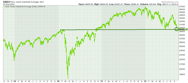
Source: Stockcharts.com
The Dow Jones Industrial Average closed below its February 2020 pre-pandemic highs.
Figure 10: Daily New York Stock Exchange (NYSE) New Lows
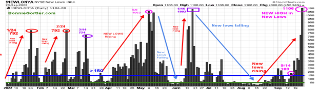
Source: Stockcharts.com
Watching new lows on the New York Stock Exchange is a simple technical tool that helps awareness of the immediate trend's direction. New lows warned of a potential sharp pullback, high volatility, and "panic selling" for most of 2022, closing above 150. As the market started to move lower in January 2022, new lows rose sharply, peaking at 792 on 1/24 and again on 2/24 (red circles), implying an increased risk of further selling pressure. Investors in early May unloaded stocks, and new lows expanded to 1063 on 5/9 (pink circle), then on 6/16 (purple rectangle), new lows made a new high of 1092. After contracting in June and July, new lows began to increase in mid-August, rising above 150 (blue horizontal line), the high-risk zone.
Last week new lows on the New York Stock Exchange Index (NYSE) rose sharply to the highest level in 2022, remaining in the high-risk zone, above 150, closing at 1106 on 9/23 (pink circle).
Caution is recommended until new lows contract and fall below 150.
Figure 11: Daily iShares Russell 2000 (IWM) Price (Top) and 12-26-9 MACD (Bottom)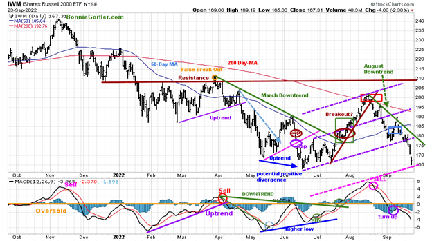
Source: Stockcharts.com
The top portion of the chart is the daily iShares Russell 2000 Index ETF (IWM), the benchmark for small-cap stocks, with a 50-Day Moving Average (MA) (blue line) and 200-Day Moving Average (MA) that traders watch and use to define trends. At the end of March, IWM failed to break out above resistance at 210.00 (orange circle) and turned lower with few rallies since the June bottom that have been unsustainable.
IWM closed at 167.31, down -6.53 %, accelerating lower and remains below Its 50-Day Moving Average (blue rectangle) and the 200-Day Moving Average (red rectangle), a sign of underlying weakness. IWM stalled below the mid-channel in early September (middle purple dotted line) at 190.00. Last week IWM broke the lower channel, accelerating lower and falling to the next channel (pink dotted line).
Short-term resistance is 175.00, 180.00, and 195.00. Support is at 165.00. A close below 165.00 would imply a further downside toward 150.00. MACD (middle chart) remains on a sell after a brief turn-up and continues to fall, implying downside momentum. The short term is negative unless there is a turn-up in MACD with a close above 185.00.
Figure 12: Weekly iShares Russell 2000 (IWM) Price (Top) and 12-26-9 MACD (Bottom)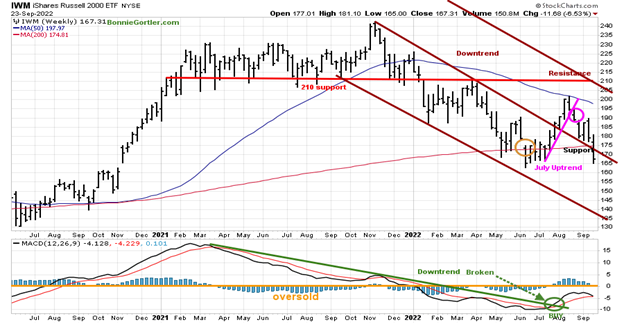
Source: Stockcharts.com
The Russell 2000 (IWM) closed stalled below the 50-Week Moving Average and then turned down, breaking the intermediate July uptrend. Last week IWM broke through support at 175.00 and turned down, closing near its lows. The downside objective is at 137.00. Resistance is at 175.00, 190.00, and 200.00. MACD (bottom chart) remains on a buy (green circle), and no sell can occur until MACD goes above zero. MACD failing to get above zero is a sign of underlying weakness.
Figure 13: Daily Invesco QQQ Trust (QQQ) Price (Top) and 12-26-9 MACD (Bottom) 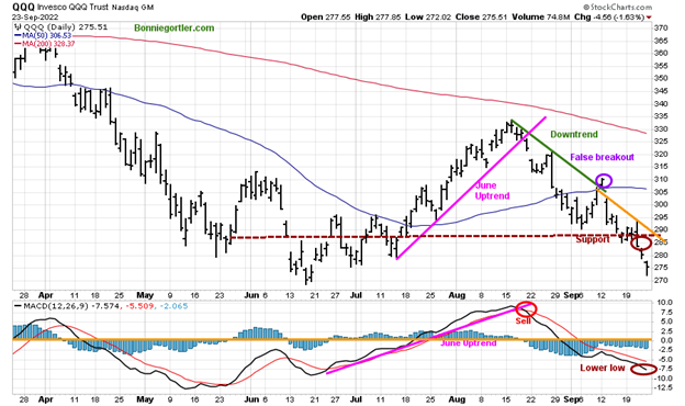
Source: Stockcharts.com
The chart shows the Daily Invesco QQQ Trust (QQQ), an exchange-traded fund based on the Nasdaq 100 Index. The two top holdings in QQQ are Apple (AAPL) and Microsoft, with over 20.00%. The direction of both these stocks will impact the direction of QQQ. QQQ sold off sharply, falling -4.60%, closing at 275.51, continuing to pick up speed to the downside after a false break out of the August downtrend (green line). Support is at 270.00, followed by 265.00, with a downside target of 250.00. Resistance is at 285.00, 295.00, and 300.00.
The bottom chart is MACD (12, 26, 9), a measure of momentum that remains on a sell. It’s a negative sign that momentum continued to weaken with the heavy selling last week. MACD made a new low suggestion caution in the near term. Bottom fishing in the Nasdaq is dangerous until at least QQQ closes above the first resistance at 285.00.
Figure 14: Apple, Inc (AAPL) Price (Top) and 12-26-9 MACD (Middle) and Money Flow (Bottom)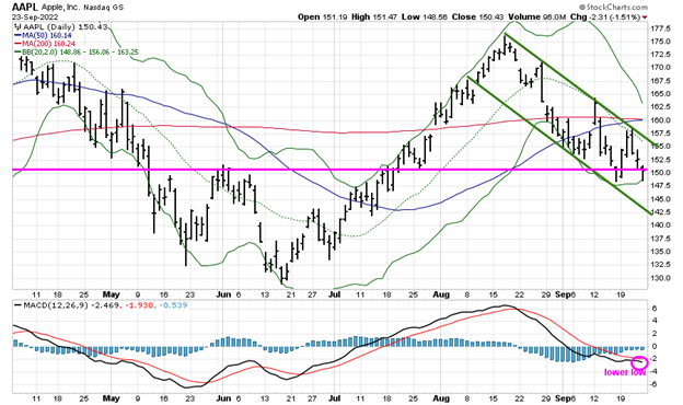
Apple, closing at 150.43, held steady, only down -0.18 for the week. The biggest holding in QQQ, However, AAPL remains in a downtrend closing below its 50 and 200-Day Moving Average, with a short-term downside objective of 142.50. A close above 160 would cancel the downside objective and potentially ignite a rally into the quarter end. MACD, a measure of momentum (lower chart), made a lower low, implying weak momentum and further weakness is likely
Follow up on previous speculative buy.
Figure 15: Weekly Invesco Agriculture Fund (DBA) (High Risk) Price (Top) and 12-26-9 MACD (Middle) and Money Flow (Bottom)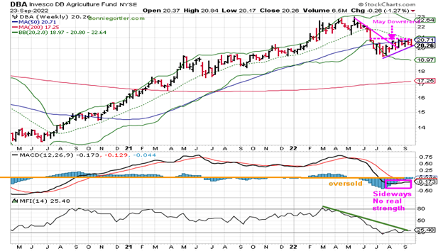
Source: Stockcharts.com
The Invesco Agricultural Fund (DBA) broke the steep May downtrend (pink line) but stalled and is in a trading range. DBA fell -1.27 % last week, closing at 20.26, slightly above the uptrend (purple line) MACD, a measure of momentum, is on a sell, moving sideways, with no real strength yet, which is concerning now.
Money flow is rising but remains in a downtrend which could change quickly if DBA moves higher.
For those who did buy, as mentioned on the 8/12 market update, to manage risk, continue keeping a tight stop if you invested in DBA. With the recent overall downside pressure in all sectors, raise your sell stop from 19.80 if DBA closes below 20.14 (slightly below last week's low). A breakout of the current trading range is likely as the 12–14-week cycle is due to end. If Money flow continues to rise, the breakout likely is to the upside. On the other hand, if Money flow begins to fall and the DBA uptrend is violated, the breakout will be to the downside. Time will tell. Continue to follow the stop.
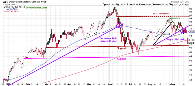
Figure 16: Energy SPDR Daily (XLE)
Source: Stockcharts.com
Energy (XLE), the strongest sector of 2022, rose in early August, forming an uptrend after its pullback from the June highs. Last week XLE got walloped, falling -9.17%, most of its loss on Friday down -6.90%. The XLE pattern has lower highs and has broken the August uptrend. It's unfavorable that XLE closed below previous support at 76.00 and now closed the 50 and 200-Day Moving Averages. Resistance is at 73.00, 76.00, and 80.00. Support is slightly below the close at 70.00 (brown line), followed by 65.00 (pink line). Caution is recommended in this sector unless XLE closes above 80.00.
Figure 17: The S&P 500 Index ($SPX) Daily and 12-26-9 MACD (Bottom)
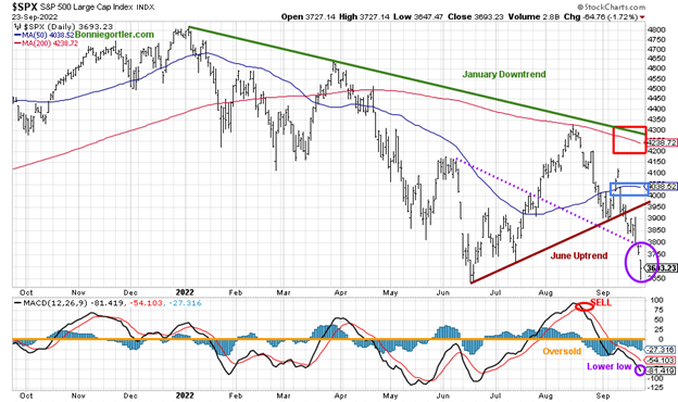
Source: Stockcharts.com
The S&P 500 (SPX) fell -4.65%, closing at 3873.33, after losing -4.79% the previous week, and closed below support at 3900.00 and below the June uptrend (brown line), and its 50-Day Moving Average (blue rectangle) and the 200-Day Moving Average (red rectangle. SPX broke below the critical support at 3800.00 (purple dotted line, and accelerated lower (purple circle). The risk of a further correction is high until SPX has enough strength to close above 3900.00, followed by 4050.00. MACD, lower chart, is oversold, below zero, and failed to give a buy after turning up. Instead, MACD made a new low, implying the SPX will likely have further downside toward the June low. The risk is high that more downside remains.
Aggressive Speculative Buy Follow-Up: The Silver Upside Breakout Is in Jeopardy
Figure 18: I Shares Silver Trust (SLV) and 12-26-9 MACD (Bottom)
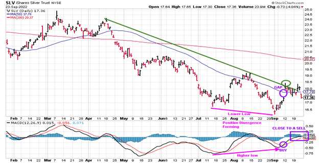
Source: Stockcharts.com
In the Market Update on 9/9/22, I suggested checking out the Silver chart and noticing the Positive Divergence forming—A Lower low in SLV with a higher low in MACD. A MACD Buy will confirm.
Silver (SLV) closed lower for the week, down -3.50% giving back most of its gains from the previous week, failing to breakout out to the upside. MACD is close to giving a sell and starting to roll over.
For those who bought, to manage risk, use a sell stop if SLV closes below 16.87.
Time will tell if Silver can follow turn back up, and a sustainable rally will occur. If you are interested in following this chart and other charts during the week, I invite you to join my FB group Wealth Through Market Charts, where I post updated charts intraday throughout the week.
Summing Up
The bears remain in control. Stocks continued to decline last week, and the technical indicators are breaking down. Market breadth remains poor as downside momentum accelerates. With the thrust to the downside, there is no sign of a bottom yet. The short term remains dubious and indicates the downside may continue, and caution is prudent. There is no need to pick a bottom. Instead, be patient until market breadth improves and the short-term technical improves. Remember to manage your risk, and your wealth will grow.
Do you like charts? I invite you to my FB group Wealth Through Market Charts or email me at Bonnie@Bonniegortler.com. I would love to hear from you. If you have any questions or comments or would like to talk about the market, click here.
Disclaimer: Although the information is made with a sincere effort for accuracy, it is not guaranteed that the information provided is a statement of fact. Nor can we guarantee the results of following any of the recommendations made herein. Readers are encouraged to meet with their own advisors to consider the suitability of investments for their own particular situations and for determination of their own risk levels. Past performance does not guarantee any future results.


