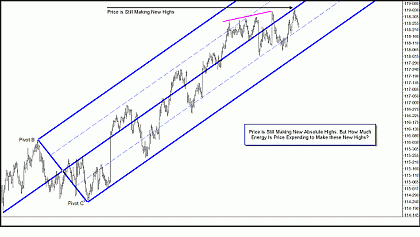
Looking at this chart, you can see that price made a series of higher highs and then pulled back before making a new, higher high. Price never tested or broke the lower parallel line and it really never broke below any major swing lows. Price worked its way higher to new highs. And “worked' is the key word!
Click to Enlarge
How much energy is price expending to make each of these new highs? Like the gas tank in a car, price only carries a certain amount of potential, or directional, energy, and when that is used up, it must either pause and refill its tank or else a change in direction (behavior) occurs. As I said, the key word here is “work:” How efficient is price using its stored directional energy? When price becomes less and less efficient, it runs out of directional energy that much quicker.
Suppose you are driving your car at 55 miles per hour, burning the gas in your tank at 35 miles per gallon, and then decide to pass a series of cars. You push down harder on the gas pedal and your engine revs up and your car speeds up to 80 miles per hour as you scoot past the cars to the right of you while your engine is now burning gas at 8 miles to the gallon! Your car's efficiency has just declined dramatically, and even though you are now further along the highway and ahead of the cars that were ahead of you, if you continue burning gas at this less-efficient rate, you will run out of the gas in your car's tank much more quickly and have travelled a much shorter distance than if you had continued to use the gas in your car's tank at 35 miles per gallon.
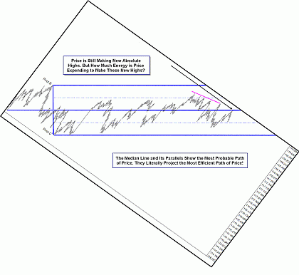
We are visual in nature, so let's see what that looks like on the same chart we just looked at.
Click to Enlarge
Price continues to make higher highs—in fact, it made a new high—but it is becoming less and less efficient. When I turn the chart so the path of least resistance, or the Median Line, is aligned with the horizontal plane, your eye should tell you that price is not making new highs. In fact, using this efficiency chart, price is actually now making lower highs! As price becomes less and less efficient, it is more and more likely to either pause to restore its expended potential or directional energy or else a change in behavior will occur.
If I hadn't turned these images, most of you would not have seen the “tell” that price is giving you. It's there for you to read, as clear a sign that when a particular poker player rubs their chin when they up their bet, they are bluffing! Price will show you where it is likely to go if you slow down and look for the signs.
Click to Enlarge
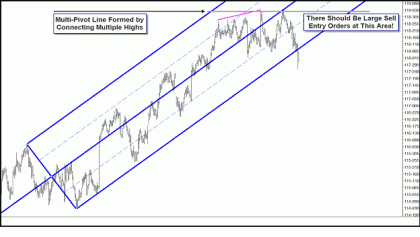
By now, if you hadn't been looking at the tilted charts, it's obvious price has undergone a change in behavior. But if you were relying on a squiggly, computer-generated line to show you signs of the coming change in behavior, it wouldn't have caught it. And most of you who just look at standard charts wouldn't have gotten excited about getting short until price broke below a major swing low or the lower parallel Line…but price was long gone by then!
Continued tomorrow in Part 3.
By Tim Morge of MarketGeometry.com