
In our long discussion on Risk Parity, it is time to measure our approach to traditional investments, notes Michael Rulle.
In our series on Risk Parity, we have discussed the Invisible Gorilla Experiment, Benchmarks and the Efficient Frontier, the Tangency Portfolio, the Volatility Skew and the Alternatives. Here we discuss.
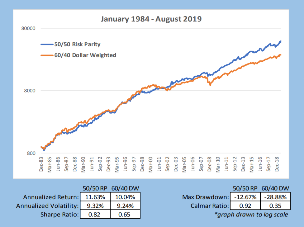
We have demonstrated that the pension fund sector has performed very much like a 60/40 portfolio with slight underperformance. We have also described how and why Risk Parity performs close to the Tangency portfolio and outperforms 60/40. We will now show three charts for the last 36 years which compares these portfolios.
The chart below provides summary statistics and comparative VAMI graphs of 60/40 vs. Risk parity. Risk Parity targets the same annualized volatility as the 60/40 portfolio for easier comparative analysis. In a real-world implementation, it is unlikely one would have the same ex-post volatility between these two portfolios. However, one benefit of Risk Parity is the investor chooses the desired risk — not necessarily to match 60/40 volatility, which due to the higher equity weighting has a much higher drawdown— as occurs most of the time versus Risk Parity.
The chart below compares the non-investable Tangency Portfolio with Risk Parity and 60/40. What is interesting is the difference in the notional weightings of the three different portfolios. As we have tried to drive home, the highest possible Sharpe ratio portfolio (the non-investable Tangency Portfolio), is very close to the Sharpe ratio and notional weighting of the Risk Parity portfolio (30% equity and 0.85 Sharpe versus 35% Equity and 0.82 Sharpe); 60/40 has 60% equity and from chart 5 a 0.65 Sharpe ratio.
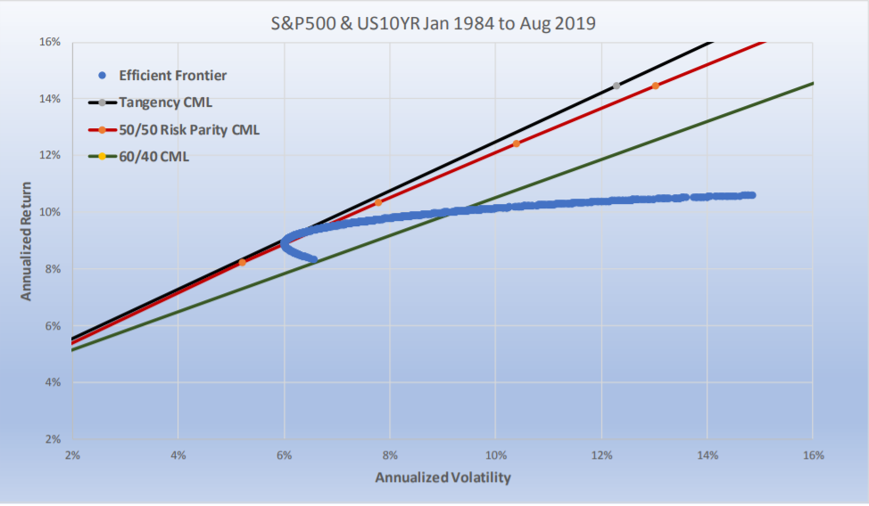
Since the Efficient Frontier (the blue line) captures all relative weightings, it intersects the 60/40 Capital market line as well. Where it crosses matches the results in Chart 5. The efficient frontier, i.e., the blue line, as we described earlier is also unlevered. The unlevered non-investable Tangency Portfolio has a total annualized return of 9.17% and a volatility of 6.16% (where the blue line intersects with the black line). The unlevered portfolio of Risk Parity has 9.20% return and 6.38% volatility (where the blue line intersects with the red line). From Chart 5 we know that 60/40 has an unlevered return of 10.04% with a volatility of 9.24%.
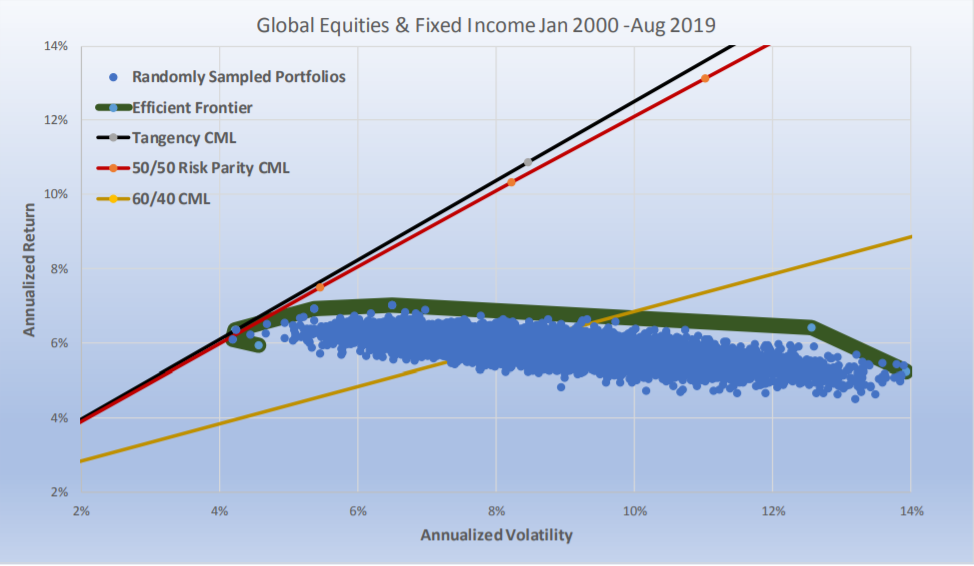
The chart above compares a more realistic global portfolio of stocks and bonds (13 futures markets: S&P 500, Nasdaq 100, Dow Jones Index, Euro STOXX 50, FTSE100, DAX, NIKKEI, U.S. five-year note, U.S.10-year note, U.S.30-year bond, LONG GILT, BOBL, and BUND), but we only 20 years of data as that was all that was available. The results are consistent with our major hypothesis and the one that should matter most to investors. In the long run, Risk Parity is as close as one can get to the Tangency Portfolio of two asset classes when the expected Sharpe ratios of the two asset classes are similar to each other.
For the ex-post Tangency Portfolio, we chose to run a scenario which would result in it getting the highest Sharpe ratio possible. Rather than grouping them in two asset classes we let the look back optimizer choose any combination of the 13 contracts.
The possible number of combinations is almost infinite. To keep it within reason we ran 50,000 randomly chosen portfolios.
For Risk Parity, we used our two asset class methodology. We equally risk weighted all equities, all fixed income, and then equally risk weighted the two asset classes and created its CML by running it at a range of target volatilities between 1% and 15%. The 60/40 portfolio had 60% of its dollars in equal dollar weighted equities, and 40% of its dollars in equal dollar weighted fixed income. The Sharpe ratio of the non-investable Tangency portfolio was 1.04; for Risk Parity it was 1.01 and for 60/40 it was 0.33. The important thing to recognize is how close Risk Parity was to the Tangency Portfolio and not how much it outperformed 60/40. The bond weightings for the Tangency portfolio was 18%, and for Risk Parity it averaged 20%.
One should find this interesting. One method (the ex-post Tangency Portfolio) simply curve fits the best result when all information is known. The other method uses a walk forward risk weighting approach (that is easily implemented ex-ante). This paper explained why this seemingly nonintuitive relationship really is the expected outcome.
Closing Comments
Institutional investors should be judged by how they perform relative to a Risk Parity portfolio of equities and fixed income. They should also be judged, not just by absolute returns, but by risk-adjusted returns. There is no basis at all for using 60/40 or the S&P 500 for a benchmark as these have little to do with Capital Market weightings, and do not incorporate any coherent framework regarding portfolio theory. The 50/50 Risk Parity portfolio comes closest to tracking the Tangency Portfolio over the long run and is therefore ideal as a benchmark.
As I was finishing the final details of this essay the Wall Street Journal announced the estimate of pension fund returns for the year ending June 30, 2019 was 6.79%. Once again pension funds underperformed 60/40 and Risk Parity for the prior 12 months as we have applied it in this essay. This is exasperating. We use the “invisible gorilla” metaphor to grab the reader’s attention, but its purpose is very serious.
All models should be as simple as possible, but not more simple than necessary. Risk parity fits that criteria. We used large cap stocks (S&P 500) and the 10-year Treasury in this study for two reasons: 1) we have data for these going back to 1926; and, 2) for the last 30 years, including six other subsets of time, it is the 60/40 portfolio of these two instruments which virtually matches the performance of pension funds.
Ideally, the reader will think of this as a thought piece. There are many ways to create a Risk Parity portfolio of stocks and bonds. For example, using all the data available, the following is another example of a risk parity portfolio versus 60/40. A portfolio of U.S. stocks and bonds from 1987 to Aug. 31, 2019 had a Sharpe ratio of 0.90 for the Tangency Portfolio, 0.87 for Risk Parity and 0.63 for 60/40. Similar comparative results occurred for the FTSE and the Gilt from 1992.
Modern Portfolio theory does allow for randomness, there will always be timeframes when Risk Parity does not approach the Tangency portfolio and when 60/40 outperforms— but as long as Sharpe ratios for equities and fixed income remain similar to each other (as they have for at least the last 100 years) Risk Parity will always be the optimal way to allocate between the two asset classes. We hope to persuade investors to focus on this approach before digging deeper into more opaque approaches to improve performance.
Modern Portfolio theory does allow for randomness— there will always be time frames when Risk Parity does not approach the Tangency portfolio and when 60/40 outperforms— but as long as Sharpe ratios for equities and fixed income remain similar to each other (as they have for at least the last 100 years) Risk Parity will always be the optimal way to allocate between the two asset classes. We hope to persuade investors to focus on this approach before digging deeper into more opaque approaches to improve performance.
Michael S. Rulle, Jr. is the founder and CEO of MSR Indices, LLC, a commodity trading advisor that offers an expansive range of index-tracking investment programs. This piece is an excerpt from a white paper titled: “The Gorilla in the Room: The obvious method of asset allocation most of us have never considered.”
Rulle inspired a family of indexes launched by S&P Dow Jones called S&P Risk Parity Indices, Rulle discussed Risk Parity at the 2019 TradersEXPO New York. Prior to founding MSR in 2015, he was president of Graham Capital Management, where he was directly responsible for the firm's discretionary portfolio managers.


