

Our last edition of Volume Analysis stated, “The federal reserve’s rocket has since overshot its orbit, causing massive inflation while providing a speculative paradise for risk assets. Now how shall the Federal Reserve return the economy to post-pandemic normalcy?” explains Buff Dormeier of Kingsview Partners.
With the first interest rate hike now under the Federal Reserve’s belt, we have more clarity on how the Federal Reserve intends to land our economic craft. Per recent Fed speak, it seems the Fed may raise interest rates 50 basis points early next month, setting up a pattern of rate hikes and beginning a $95 billion monthly balance sheet reduction.
This series of Federal Reserve actions is akin to punching the pedal to the metal, holding it down for nearly two years, and then suddenly slamming on the brakes. Although I applaud their original measures, the recent Federal Reserve expectations are probably not what investors envisioned as a soft landing.
The last time the Federal Reserve simultaneously raised rates while reducing its balance sheet was the “Powell Pivot” in 2018, which did not bode well for the markets. Perhaps the market has already discounted these actions? Or could this time be much worse with inflation at 40-year highs?
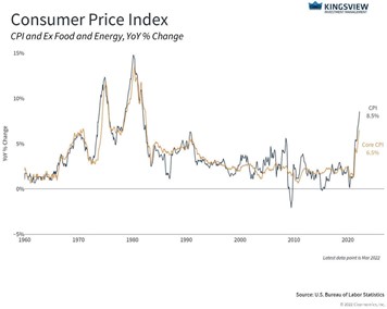
Chart 1: Inflation
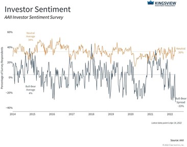
Investor bullish sentiment presently resides at only 15.8%, perhaps due to inflation and the Fed’s newfound resolve to end it. This sentiment reading is among the ten lowest ever recorded and the lowest reading since 1992. Traditionally, low bullish investor sentiment readings indicate investors have already sold out and the markets may be overdue for a rebound.
Chart 2: Investor Sentiment
Federal Reserve actions have already had a dramatic impact on bonds. After a negative year last year, year-to-date treasuries are down -7.9%, aggregate bonds are down -8.5%, corporate bonds are down -11.1%, and even municipal bonds are down -7.5%.
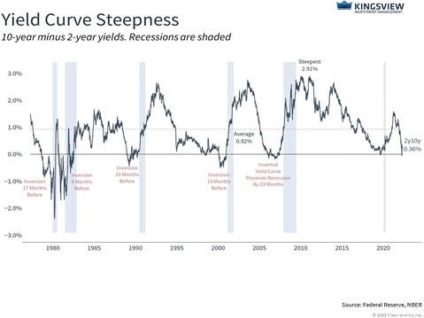
More concerning are yield spreads, which are the difference between long, intermediate, and short-term rates. Historically, when the rates of short-term bonds are higher than long or intermediate-term bonds, a recession often ensues within a few years of the event. Many short-term interest rate yields exceeded their intermediate-term counterparts early this month. Presently, the yield spread between two-year and ten-year bonds is barely positive after being flat earlier this month.
See the chart below:
Chart 3: 10 Year – 2 Year Yield Spread
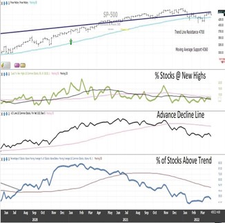
Bonds are the setup, but what we really want to discuss is stocks. In our graph below, the top panel shows the S&P 500 (SPX). Note that the S&P 500 has fallen underneath its long-term resistance channel, the dark blue line, which formerly acted as support for much of last year.
The top of this channel represents current resistance residing at 4700. The next panel below shows our three market breadth indicators, the percentage of stocks at new highs in green, then the advance-decline in black, and at the very bottom, the percentage of stocks trending higher in blue. Note that all our breadth indicators are presently in decline, which is not a good look for the prospects of breaking above resistance.
Chart 4: Market Breadth
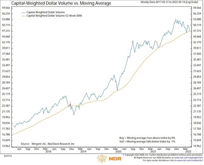
Moving down to chart five, our proprietary capital weighted dollar volume tells us the direction of money or capital moving in or out of the markets. Note that the dollar volume in blue is meeting its trend line in orange. This means we are at the crossroads between maintaining a bull market’s current correction phase or entering a new volume analysis bear market.
Chart 5: Capital Weighted Dollar Volume
Moving on to the next volume chart six, we have not capital weighted dollar volume, but rather our proprietary capital weighted volume. Capital weighted volume indicates the liquidity of the markets through share volume as opposed to capital flows. This leading indicator, also in blue, is at the trendline in orange as well. Like capital weighted dollar volume, it is very close to breaking down. If either of these indicators were to break 1% below the trend, this would trigger a volume analysis bear market.
Chart 6: Capital Weighted Volume
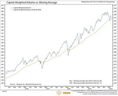
Together these last two capital weighted volume charts tell us the market needs to catch support here…or look out below. Keep in mind that these volume indicators, along with the advance-decline line, all led the market up before the S&P 500 breakout in 2020.
They are all now lagging in the market, a sign of weakness. Over the past two years, when pointing out similar junctions (although first emphasizing risk), we have predominately suggested buying the dips. This time we are not so giddy and are not suggesting selling or buying this dip, but instead awaiting the forthcoming resolution.
Finally, in our last chart, we go back to bonds as they are driving equities. We have the 30-Year Treasury Bond (TYX) price trend, which has been in a steady uptrend for over 40 years.
Chart 7: 30-Year US Treasury Bond
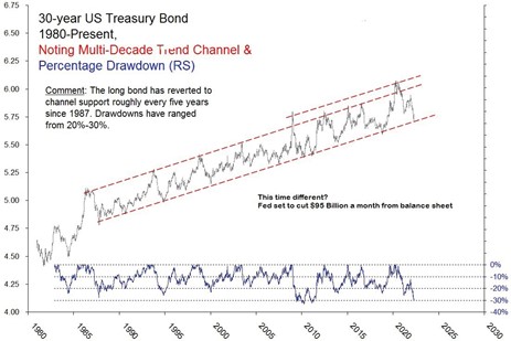
This, of course, equates to lower yields. Note in the chart that the 30-year bond seems to fall back to its rising price trend every five years or so. Hopefully, that is what is happening currently. But if not, and the long bond was to break through its long-standing uptrend, it could mean serious damage for bond investors and stocks.
Sir John Templeton once said the most dangerous four words in investing: “This time, it’s different.” Why could this time be different? First, we intuitively believe that in a healthy economy, interest rates cannot keep going down forever. Second, the Fed seems dead set on reducing the inflation they previously said was transitory. As mentioned earlier, the Fed is considering raising the short-term rate 50 basis points in a few weeks with multiple hikes afterward. They are also reportedly considering a $95 billion monthly balance sheet reduction. However, this trend has held for a long time, 35 years.
A strong trend line should not be discounted.
Investors seek successful outcomes. Such outcomes do not come only from exaggerated upside capture, but also through risk management. Investors tend to fear fluctuations and corrections, but it is bear markets that may destroy their financial plans. One of the keys to thriving is avoiding bear markets, especially during the withdrawal phase of retirement.
Overall, S&P 500 resistance resides at 4700, and significant support may be found at 4250. It seems we may be on the cusp of potentially entering multiple bear markets, where risk/reward is balanced. I believe the best practice is to await the direction at the crossroad and go with it, wherever that may lead.
Keep an eye out for the upcoming Volume Analysis Flash Updates to learn which fork in the road our markets travel. All the best, my friends.
Learn more about Buff Dormeier here.


